
Back in elementary school, I used to despise Goosebumps’ choose your own adventure books. It is excruciating having to flip through pages after pages at a whim only to follow a plot that ends up being ultimately unsatisfying. I don’t have a problem with the concept itself, mind you, as there are a lot of videogames that uses the same design principle that I greatly enjoy. I just don’t think the concept necessarily works on paperback form.
As such, I tend to not like pieces on the internet that requires me to jump through several different links to get the whole picture. It tends to break the flow of the piece itself and while switching between browser tabs is simply a minor inconvenience on desktop browsers, it’s quite a hassle on mobile browsers. Apparently, the world sort of understands my concern because currently, there’s a trend in web development called single page website that aims to rectify this.
One page is all we need
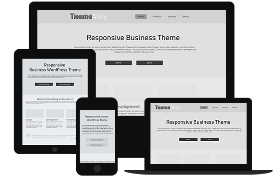
A single page website is exactly what it says in the title, it’s a website or a section of one that displays all of its content within a single page. As mobile internet traffic has finally overtaken traditional desktops, single page website emerges as one of the mobile-friendly solution for web developers. Consolidating your entire content inside a single page could do wonders to your internet experience, such as:
- Helpful for the one-handed internet experience
When the iPhone first came out in 2007, it comes with a diagonal screen size of 3.5 inches. For a time, the world continues along like that until Android phones began to tinker with larger screen sizes. When Dell arrived on the scene with the at-the-time gargantuan Streak 5 that came with a 5-inch screen, the late Steve Jobs famously stated that ‘no one’s going to buy that’. Then the Galaxy Note came along, popularizing the term ‘phablet’, a portmanteau of the word phone and tablet and the rest, as they say, is history.
In 2014, a study came out that the average screen size of smartphones stood at 5 inches, well above the average of 3 inches in 2007 and that it’s still on the rise. The current data is a bit skewed considering smartphones now comes with taller, but not wider, displays but let’s just say that they’re just as wide as 5.5-inch 16:9 smartphones. This has resulted in smartphone companies adding a one-handed mode for easier multitasking, which mitigates the problem. Single page websites aims to solve it completely.
Because scrolling is easy to do on a smartphone, single page websites effectively utilizes the gesture capabilities of smartphone while at the same time eliminating its biggest problem, tedious tab switching. To accommodate the conventional desktop experience, usually a table of content is added onto the page, like what you’d see on Wikipedia so that quick navigation is still possible. It’s not a compromise; it’s the best of both worlds.
- It’s ideal for longform and/or detailed contents
Remember when newspaper displays a story on the front page only to force you to open another page to read the rest? Annoying isn’t it? Websites also suffer from the same mistakes, especially when it comes to hardware reviews where several different pages are dedicated to specific parts of the hardware. This is annoying as again, you’re required to switch between tabs to take in the whole picture.
Imagine if they work like this story on Cape Town’s drought problem from the Huffington Post. Like the point above, going with a single page website doesn’t mean you have to give up on quick navigation as Wikipedia has been utilizing table of contents and quick links for more than a decade. As a compromise, web developers could also use multi page design while still adding a view as a single page option, as used by several different websites.
- They can offer a great multimedia experience
Check out this excellent story from SBS Australia on the 2003 Sydney student murders. That is probably one of the best presentation I’ve ever seen when it comes to longform journalism. First is obviously the excellent animation, which I believe employs a technique called rotoscoping, a technique I’ve always loved since I first saw A Scanner Darkly. Second is the seamless mixture of images and videos interspersed within the piece itself, which enhances the main text instead of distracting users from them.
Third, and my personal favorite, is how the piece differentiates between the perspective of Ram Tiwary, who was falsely suspected and then charged for the murders before being ultimately acquitted and Malcolm Knox, the journalist who set out to explore the issue in the first place. To switch between the two perspectives, the page uses a swiping (or drag for desktop) gesture and display the face of the man you’re reading from in the bottom. It’s admittedly slightly gimnicky but I personally think it’s brilliant.
The burden of carrying an entire page alone
Here comes the bad part, single page website has limitations inherent to its solitary nature. They’re not gamebreaking and you can actually mitigate some of these limitations but they are always there. Some of these limitations include:
- They are relatively slow and might take up ample resources
Obviously if your single page website consists solely of text, this won’t be a problem but chances are that it will include other things so how fast it will load should always be taken into consideration. One of the ways you could mitigate this is by using trigger scrolling where more contents are loaded only when specific conditions are triggered. There are automatic triggers and manual triggers.
Automatic triggers can be seen with Buzzfeed’s main page, where if you scroll down, the website will automatically loads more content at the bottom of the page. Manual triggers can be seen with Techcrunch’s main page, where if you scroll down, you’ll see a button that says load more and only if you tap or click that button will the website loads more content. This way, users can still load the main page quickly but the more contents are loaded, the page will take up more and more resources.
- It’s not going to work for or with everything
To start with, an e-commerce website simply won’t work with this approach and even then, truly single page website is pretty rare. The Buzzfeed example above only uses the single page approach on its main page with each content transporting you to a different page. Techcrunch is close to being a purely single page website, with most contents being loaded within the same page but some, like the Events section, still takes you to a different page.
Still, this doesn’t mean that you shouldn’t use the single page approach; you just have to be rather smart on where to use it. The main page of your blog and any longform contents will work with this approach. Additionally, resumes and portfolios also work well with single page designs.
Final thoughts
Even though I greatly appreciate what single page design brings to the table, I also realize that it’s not good enough to actually replace what’s on the table. The multi page approach, even with its mobile-unfriendliness, still serves an important role in today’s internet. Instead of being the electric car of web development, single page website is more like a diesel engine. It has its own advantage over petrol but its drawbacks limits its usage and it’s now in a peaceful coexistence with petrol engines.


