Extended Stay: 4 Tips on Reducing your Website’s Bounce Rate

business tips

The first two words of Radiohead’s 2016 masterpiece, A Moon Shaped Pool, is stay in. The last two, don’t leave. Read together, they form a sentence; stay in, don’t leave. It could be simple coincidence but A Moon Shaped Pool came out less than 12 months after lead singer Thom Yorke’s divorce with his wife of 23 years, Rachel Owen, and there are a lot of things on the album that hints at this, especially the closing track, ‘True Love Waits’.

A Moon Shaped Pool came out on a Sunday and even after more than two years, I remember the moment ‘True Love Waits’ hit me. I put that song on repeat as I lie down on my bed crying with that song playing in the background. I used to joke that I never have problems making people fall in love with me, it’s getting them to stay that way that’s tricky and naturally, what’s true in love is also true in web development. I mean, we even have the term bounce rate that basically covers the same concept.

Stay in, don’t leave

In retail, whether traditional or online, we’re familiar with the concept of window shopping, which is an activity where a person browses through a store’s merchandise without any actual intention to buy anything. Even though you’re seeing only an increase in traffic but not sales, window shoppers are usually a good thing since there’s a good chance they would make a purchase at a later date. The wishlist feature available on most e-commerce platforms was meant to facilitate this.

Bounce rate on the other hand is the kind of traffic you’re not necessarily looking for. The term is defined as the ratio of single-page visits against any other traffic. Bouncing is markedly different compared to window shopping because window shoppers usually click through multiple different pages first. Bouncers usually take one look at your website and then immediately head for the exit. Given that almost no one in the internet is actually pressed for time, it can be surmised then that the problem probably lies with your website.

Bouncing is something you want to minimize as much as possible but the problem with bouncing is that there are various possible causes. It could indicate that your website has a horrible first impression, you might simply be attracting the wrong kind of traffic or that your content has terrible presentation. In the following section, we’re going to dissect each of these points and the possible solution you could try.

Didn’t want to leave you with the wrong impression

First thing first, you want to remove any intrusive ads or interstitial pop-ups from your website immediately if there are any. Google hates them, I hate them and that adorable pomeranian I regularly see on my morning run probably hates them too. Trying to shove supposedly great offers down your visitor’s throat right off the bat isn’t attractive and it actually spotlights your lack of faith in your own website. Let your website and its content speak for itself and stop relying on cheap tactics to try and rope more customers.

If your website is free from such distractions but you’re still seeing a relatively high bounce rate, it is possible the fault lies on your website itself. For me personally, amateurish-looking, excessively loud and poorly organized websites are a turn-off and if I saw any of that in any website I visit, my hands instinctively move to close that particular tab. Try to show your website to the people in your life that’s not attached to your business to get some genuine third-party opinions if you’re unsure about how your website would hold up against the general public.

Attracting the wrong kind of attention

One possibility that might affect your bounce rate is that you’re simply getting traffic from all the wrong places and this might indicative of a fault or a misunderstanding in your SEO strategy. It is possible for example that you’re focusing on the wrong kind of keywords or that your PPC ad is being shown to the wrong people. When it comes to SEO and marketing, there are two things you have to focus on, the type of content you’re doing and the channel you use to market them.

The common misconception when it comes to SEO is that people seem to think that far and wide is the best philosophy when a focused and targeted campaign is actually preferable. A campaign netting 1 million in traffic but only 5% conversion brings far less value than a campaign netting merely 250,000 in traffic but a conversion rate of 50%. Do proper market research first and build your marketing campaign around the data you’ve collected instead of simply going for the lowest common denominator.

When it comes to presentation, the devil’s in the details

I’ve had this done to me repeatedly over the years so I think I’m completely in the right when I say that editing matters and this is all the more important when it comes to video and written content, especially written content. It honestly matters little how good of a writer you are if you can’t present that in an easily digestible way. Content writing, usually written with a marketing or sales intention in mind is a whole different ballgame compared to creative writing, where it is usually okay to be indulgent.

In content writing, you need to figure out a way to get your point across as engagingly as possible without using more words than necessary. In a way, content writing can be difficult than creative writing because it requires a different skill set that the typical writer might not be in possession of. Overly long paragraphs and complex sentences, two things that I’m regularly guilty of, are verboten so edit and reedit your writing to trim those fat as much as possible.
How to Improve Your Restaurant Reviews and Why It Matters

SEO tips

To be honest, I am a dedicated user of Zomato app. When I look for a new place to eat, I find it on Zomato. When I want to know if a restaurant is worth spending money on, I look for the restaurant reviews on Zomato. I was once so curious with this new All-you-can-eat BBQ restaurant near my living place because I found it on Instagram and I think people were so hyped up because the restaurant went all out for the Instagram ads. However, with so many good reviews on Instagram, when I saw the reviews on Zomato, I was taken aback by the bad reviews. I mean, it was so different than what appears on Instagram. This made me feel in doubt whether I should go there or not. Therefore, if you ask me whether restaurant reviews matter or not; yes, they matter. If you have a restaurant business, keep in mind that reviews from your customers are one of the most important aspects in your business’ decision makings. Also, if you are hiring an agency to do SEO services for you, reviews are helpful for improving your SEO as well. Research says that 60% of restaurant-goers read online reviews before going out for a meal. Also, customer-written reviews on websites like Yelp, TripAdvisor, and Zomato are preferred by 25% more people than reviews written by professional food critics. In short, reviews encourage customers to decide whether or not they should try your food. Aside from that, the better the reviews, the better your chance to get values from search engine like Google. Your restaurant reviews can play a part in local search visibility, especially in Google Reviews, as now Google My Business listing is very important for local search. Therefore, make sure you claim you Google My Business page. With that in mind, how can you improve your restaurant reviews? Keep reading this article to find out!

Promote your restaurant’s presence on online review sites

Well, to get started, before improving your restaurant review itself, get as many reviews as possible. You can ask for reviews to your customers who are currently dining in your restaurant. Another way to do that is by promoting your restaurant’s presence on online review sites through your official social media accounts, website, email newsletters, blog, business cards, brochures, receipts, etc.

Learn from your mistakes

I have seen online shop or restaurant owners end up getting angry at those who delivered bad reviews about their business. Well, bad reviews are there to remind you that you are not perfect. You should be glad that they ask you to improve sooner before it’s too late. Therefore, when you see bad reviews, filter the messages and find out what is still wrong about your business and what you can improve from that. Write all the negative parts and what lacks from your services and menu. Learn from those mistakes and improve your services.

Use your social media business accounts

If your restaurant already got many bad reviews that you ended up with the rate below 3.0 (per 5.0), social media platform is the best way to get attention again from both new potential customers and your previous customers (perhaps those who wrote bad reviews about your restaurant too). Increase your brand awareness more effectively using Instagram ads as well. Hire several professionals who can take high quality photos and videos of your food and restaurant and post it to Instagram story and post ads. This will improve your restaurant reliability and surely catch people’s attention.

Hire social media influencers

Okay, this might be a little over budget, but a little help from social media influencers can boost your restaurant reliability and quality in the eyes of your customers. Not all social media influencers are expensive. Okay, maybe you can hire the expensive one but the rest of them are the ones with no more than 20k followers. As for the popular one, maybe you can hire a social media influencer with 300-500k followers, but that’s it. If you have more in your budget, you can choose your own social media influencers. I recommend those who are focused on culinary and food topics in their page.

Yes, that’s how you improve your restaurant reviews. It may not immediately improve the rating; after all, it depends on your restaurant quality as well. Remember that bad reviews are not always bad. It simply reminds you to improve your quality for a better restaurant business. If you need more improvement on this, you can contact us now and let our team help you.

Design Language: 4 Things to Consider when Choosing a WordPress Theme

Design Language tips

As of 2018, WordPress remains far and away the most popular content management system in web development, with the platform capturing a sizable market share of 31%, far eclipsing the second-placed Joomla, coming in at a measly 3.1% market share. WordPress owes its popularity mainly because of two reasons, its sheer versatility and the simple fact that at its most basic version, it is available for free. There’s just no denying free stuff.

Technically though, WordPress works under the ‘freemium’ model, in which plugins and themes, the very reasons for WordPress’ versatility, are separated into free and premium ones, just like with mobile apps and games. These themes and plugins come for the most part from third-party developers, owing to WordPress’ open-sourced nature and as such, WordPress is an embarrassment of riches when it comes to the number of options available. Some might say there are way too many options.

Finding the right WordPress theme

Choosing a theme is usually one of the first and primary decisions you’ll have to make when starting out with WordPress. Themes aren’t just about looks. Basic functionality, layout, aesthetic impressions, the overall design language of your entire website is going to be heavily informed by the theme you’re going with. Apple didn’t merely stumble into their cohesive design language, shaping every piece of product in their lineup, both software and hardware, by accident. They did it through careful research.

Now, due to its open source nature, it is actually possible for you to design and develop a customized WordPress theme of your own, either from scratch or working from what’s already available but for most small businesses, this is usually unnecessary. The decision then, boils down to a choice between the plethoras of themes available for WordPress. In one marketplace alone, Themeforest from Melbourne-based Envato, there are over 10,000 themes available, packed like sardines in a crushed tin box.

To help you navigate and differentiate between this overly crowded market; here are some factors to consider when choosing a WordPress theme:

  • Choose between simple themes or a comprehensive framework

To put another wrinkle in your decision process, WordPress framework is the current trend in web development. Remember at the beginning when I said that WordPress themes also account for functionality? WordPress framework works by pushing all of those functionalities within the framework itself while themes consist solely of stylistical options. In a WordPress framework, you basically have two themes; parent themes dictate the functionality while child themes dictate the actual aesthetics.

The benefit of going with a framework is that it makes WordPress more in line with full-on web builders like Wix or Squarespace by allowing easy, drag-and-drop codeless customization and seamless theme switching but with the caveat that you can’t perform under-the-hood modifications as freely as you’d like. Usually though, framework already has a lot of functionalities and widgets built-in that you normally won’t have to add one yourself.

  • Just the right amount of functionality

First, consider what functionalities you’d like to have with your website right now and those you’re considering in the foreseeable future. Now, choose a theme that fulfills those needs with the minimum amount of baggage. A feature-rich theme might sound attractive but if it consist of features that are irrelevant, don’t bother. Those extra functionalities are just going to slow down your website and since load speed is now a Google ranking factor, a slow website isn’t something you want to be burdened with.

Technically, you can still add functionalities with plugins but again, adding more baggage is going to slow down your website, so try to go with a theme that already has the functionalities you need built-in to the theme.

  • Responsive web design and mobile-friendliness

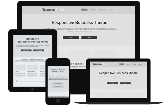
Mobile web browsing has overtaken the conventional desktop experience in 2016 and you need to adapt your website for optimal viewing on diminutive displays and gesture-based navigation. The one method of solving this is by using responsive web design, in which the webpage detects the medium it is being displayed and adapts itself. Choosing a non-responsive theme in 2018 is akin to connecting to the internet with a 56k dial-up connection. It’s just too anachronistic of a choice.

  • Finding the right aesthetics

Take a glance at the selection available in Themeforest. On the left-hand side, there are a lots of different tags you could use to filter out just what exactly what kind of website you’re looking for. Food & beverage? Technology? A design portfolio or a resume? There are tons of themes available for various specific needs and choosing the one that fits the aesthetic you’re looking for should not be a problem. There are various considerations to factor in before you jump the gun, however.

First is the available color palette. Assuming you’ve already settled on a logo for your business, you need to find a theme with a color palette that could complement your logo. Some themes are available with unlimited color options while some, usually the free ones don’t. The second factor is legibility. If you’re working in the creative and/or visual industry, this might not be a primary consideration but for businesses working in professional services, you should always balance style with substance. Fussy, visual heavy design tends to not work with law and accounting firms.

Additional considerations

The example marketplace I gave here, Themeforest, deals exclusively with premium themes. If you’re looking for the free ones, the directory on WordPress website is a good place to get you started. Here’s my advice though, try to avoid themes that are made by an individual. Those tend to be extracurricular excursions and since there are no professional obligations, questions of supports and updates are always going to be on your mind.

There are a lot of organizations dedicated to making WordPress themes and most usually offer free themes to go with the premium ones. The free ones are usually restricted in some ways, with less functionality and a limited color palette but if you can live with those restrictions, those free themes are a definite bargain because getting support will be much easier than from an individual designer.