The Follow-Up to Content Creation: 4 Content Promotion Tips You Should Try

SEO tips

There are two folders in my Evernote account with one labeled ‘Fiction’ and the other ‘Non-fiction’. As you can probably infer, the ‘Fiction’ folder is dedicated to my attempts at writing short stories while ‘Non-fiction’ is for when I have something to say on things around the world or just in my life. As of now, there are 58 entries in the ‘Non-fiction’ folder while there are only 10 in the ‘Fiction’ folder. I am laughably atrocious when it comes to writing fiction.

Considering I’ve been using Evernote to keep track of my writing for about 8 months now, I think it’s fair to say I’ve been quite productive since I only get to write for myself when I have a free weekend. Except for the fact that at least half of those entries are nowhere near finished. Following through on things has always been a weakness of mine and this has also been a problem for SEO services, where the business of content creation isn’t accompanied by an appropriate content promotion strategy.

Recognizing greatness

You know it’s funny but I never really had problems in finding something to write about, every time I saw something interesting or read about something that caught my eye, I always make it a point to write it on Evernote with a plan to expand on it in the future. It’s why under an entry labeled ‘A Lack of Identity’, there are only a collection of random thoughts on Elizabeth Warren’s DNA tests and on the Subtle Asian Traits group without a coherent unifying theme.

For me, it’s very easy to feel inspired but sustaining that level of inspiration to write 2,000 of understandable and naturally flowing collection of words tend to be beyond my reach most of the time. And even when I do manage to pour my thoughts into a piece of writing, the fact that I’m going to have to compete with millions of other, better writers can be a bit of a downer. The simple truth is that there are just so many contents, not just articles and/or blog posts, floating around the internet that ensuring you could get just one reader felt like an impossibility.

If a tree falls in the forest and no one is around to hear it, does it make a sound? Or alternatively, the 21st century version; If I ran into Nicole Kidman at the Australian Open but no one took a photo of it an uploaded it to Instagram, did it really happen? Quality content is great and all but quality is useless if no one’s there to recognize it and that’s where content promotion comes in. The idea is simple, spread the word and make sure your content gets the highest number of audience possible and here are 4 ways you could use to achieve this.

Effectively use your mailing list

Despite being twice as old as yours truly, e-mail remains an effective form of communication, especially for the purpose of content promotion. E-mail is where I received most of my reading materials, it’s where I receive information on events happening around the city and it’s also where I receive information regarding sales or other promotions from brands I care about. Long story short, e-mail is important.

The truth is, the internet is not at the point of obesity; there’s simply too much stuff floating around. My queue on Netflix is so loaded that I literally cannot add more things to the queue. I have a subscription to Marvel Unlimited with the intention of catching up to current comics but I’m still reading comics published in 2007. The beauty of an e-mail newsletter is that things are delivered straight to your audience’s inbox, saving you from having to compete with other things available online.

Share them on social media but always time your posts

About 79% of Australia’s population use social media so it makes perfect sense that you use social media as a content promotion platform. What can sometimes be lost in the discussion is the question on when should you post on social media? Depending on which part of the demographic you’re trying to court and various other factors, the answer to that question is going to be different so do your research if you want your social media posts to reach the most audience.

Use hashtags intelligently and in moderation

Hashtags is an effective way of inserting yourself into the conversation in social media. This can be especially important if one of your contents is created specifically to tap into the zeitgeist, in response to whatever it is that’s currently trending. By incorporating hashtags into your social media posts, you can increase the likeliness of your content being discovered by people who are unfamiliar with your brand but are interested in your industry, which might help you gain new customers.

Extend your reach with the help of influencers

I personally dislike the term influencers, I prefer the more old-fashioned term thought leaders, but there’s simply no denying the effect they have on the public. Influencers are well, influential, because unlike the typical celebrities, they usually have an idea what they’re talking about. For small businesses, even a simple word from these people could hold enough sway to turn their fortunes upside down.

There are various ways you could use influencers for the purpose of marketing. The easiest way is to get them to mention your brand, either by directly paying them or in some sort of cross promotion in a quid pro quo exchange. One other way is to get them to review your product and/or services objectively. The latter is more risky but if you have the utmost confidence on what you’re selling, I’m not going to stop you.
The Important Elements of Modern Web Design for Your Business

web design insights

As time goes by, we can see many things changing gradually but surely. Not only that, we can even see new things coming into our growing digital world from time to time. Yes, that’s what it means to live in a modern world. For that reason, we are required to adapt to new things and adjust to anything in this era, especially if we are living the life of a business person. If you are a business owner, your mind is required to adjust to new things and to be always on the move. In short, in this modern world, you need to have a modern mind. Though it doesn’t necessarily mean that your need to completely leave the traditional things, you have to think like how the modern people think. For example, we know for a fact that a business needs a website. But it doesn’t stop there; a website needs its web design. And that web design, of course, needs a lot of improvements in a world where almost everything constantly changes. For that reason, there are many modern web design elements made for improving a website – those new trends. New trends in web design are made for helping people create a new look for their website and branding so that the website has different and unique style to tell stories and explain the company behind that website. That being said, it doesn’t mean that we have to include every trend that comes about on our website. With so many options to choose from, it can be tough to decide which ones are really worth considering. But don’t worry! I’m here to help you narrow down the most important modern web design elements for your business through this article. Keep reading to find out!

Unique and large Typography

Every company has a specific font or typography that they use for differentiating their company from their competitors. This font is what defines the company’s branding and identity. In recent years, designers have received a larger selection of fonts to choose from, making it easier for brands to more accurately express themselves through typography. Aside from branding and making your company unique, typography can also help “lead” your website visitors to the specific page they want to see. Creating unique and large typography is also a part of making your business branding more standout among your competitors. However, make sure the size of the font you choose supports any browsers and devices so that your website is user-friendly.

Large and responsive hero images

I’m not going to lie, strong visual experience intrigues me. Sometimes I think I don’t have to travel to all places in the world to see something amazing. Just seeing a great visual element “carved” in a single touch of skilled photography makes me feel like I was in there for real. The same thing applies to hero images on a website. By focusing on a great visualisation of an image, you can help your visitors understand you more and encourage them to stay on your website. Aside from that, large images can help visually tell your story without having to depend on just text. That being said, large images may be hurting your website’s loading time, so make sure you consult to your web designer to make the hero images you are using become responsive and user-friendly.

Background video

In this modern world, we may have seen many websites using background video to enhance more visual experience for their website visitors. A background video can serve as a brilliant way to get the visitor more engaged to click-through to the main video. With a background video on your website homepage, you will not only entertain your visitors from the moment they land on your page, but you can also help your visitor understand the key important points about your company without them having to read every single line of text. It is like you are already communicating with your visitors with the video. Again, putting a video on a website needs to be carefully and properly executed because size matters. If you want a user-friendly website, make sure you consult to your web designer first.

Those three are the most eye-catching web design elements for me. Whenever I land on a website page and see those elements, I always feel hyped up about the website and stay longer than usual because it is so interesting. A website is like the bridge of communication between a business owner and a consumer. Therefore, do all the best to provide a high quality website both in terms of content and design. If you don’t have a special web designer yet, you can contact us now and let our creative designer team assist you with your website and your business.

Beautiful Backdrop: 4 Tips on Using Fullscreen Images as Backgrounds

Tips on Using Fullscreen Images as Backgrounds

Last year, a story popped up on The New York Times about how the celebrated Japanese composer and musician Ryuichi Sakamoto ended up creating a playlist for a restaurant in New York. The gist is that Sakamoto frequented this particular restaurant and was so annoyed at the music that he finally went to the chef, gave him a piece of his mind and offered to curate the music himself, without pay of course, so that he could feel more comfortable eating there. Interestingly, none of the songs he picked are from his own composition.

What Sakamoto did there might seem a little bit fussy but Sakamoto, a noted film composer who’s won an Oscar for his work on The Last Emperor, knows just how essential background music is to the whole experience. It’s not just with film and food, background elements are essential in almost everywhere and in web development, this practice manifest in the use of website backgrounds. Plain backgrounds are simple and don’t involve much consideration other than color but if you’re using an image as a background, that’s where things might get a little bit tricky.

Choosing things for the background

In a very weird way, choosing things that could work well in the background might actually be trickier than when you’re choosing things for the foreground. I have a friend who sings in both a band and a chorus and I’ve been told that singing lead vocals on a band takes a very different approach compared to when you’re singing in a chorus or when part of an ensemble. In an ensemble, you actually have to make an effort to not stand out, to blend in with the rest of the group while being the lead vocals on abad carry much less restrictions, although you still have to make an effort to sync with the rest of the instruments.

The Sakamoto story I provided above sheds some light to this particular issue. Take a glance at the playlists Sakamoto provided and you’ll see that the included songs aren’t exactly something you’d want to listen on your free time. This is by design, a good song doesn’t necessarily make good background music and what makes good background music might not have the same effect when played in the foreground.

Unsurprisingly, these same considerations should be taken into account when you’re trying to choose an image as a background. It’s the same case whether you’re trying to use an illustration or a photo as a background, you can’t just simply pick what might be objectively considered the best image, you have to consider that image together with the foreground elements of your website. Before you start feeling overwhelmed, here are some general issues you might consider when using fullscreen images as your background.

Use only high-quality images

1080p is the standard resolution for most smartphones with some Android phones upping the ante to 1440p. The last few years have seen an increase in 4k screens mostly in the computer space but Sony has actually released phones with a 4K HDR screen although it remains to be seen whether other manufacturers would follow suit. Anyway, the point I’m making here is clear, make sure that the image you’re using is of a high-quality to ensure they won’t become pixelated.

Strike a perfect balance between the background and the foreground

Images in general are ‘noisier’, for a lack of a better word, than plain backgrounds. Taking this into account, it is advisable for you to use less foreground elements than you normally would when you’re using plain backgrounds. The noisier the image, the less room you could mess around with your foreground elements. The one approach I like to use is start with picking the image first and then to start adding elements into the image until it’s too crowded. If you feel like one image isn’t giving you enough room, it’s time to try a different image.

Make good use of color contrast

Now, here’s the elephant in the room. When you’re choosing images for your background, you need to make sure that the image you’re choosing won’t obscure the text in the foreground. Having a background that overwhelms the foreground is a cardinal sin and is the sole reason why you have to take a different approach compared to when you’re choosing images to use in the foreground. The most basic choice would be to use white text on a black background or vice versa but that would seriously limit the kind of image you could use.

Thankfully though, there are shortcuts you could use even if the image you’re using is tad bit too overwhelming. The first thing you could do is to limit text placement only on certain parts of the image. If there are parts of the image that are more uniformly darker or lighter than the others, you could place texts around that area. Alternatively, you could selectively alter parts of the image to make it more habitable for text. Other solutions include using a colored text box to make it more legible.

Make sure your layout works with both landscape and portrait orientation

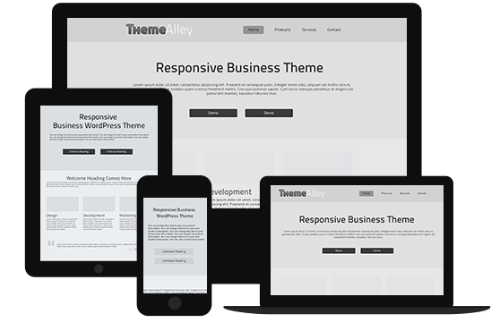
Mobile internet traffic is now bigger than desktop internet traffic. This has been the case for several years and frankly, I don’t think it’s going to change anytime soon, if ever. As such, you need to take steps in ensuring that your website is just as accessible on a phone screen as it is on the computer. Now, I’ve talked a bit about how you could play around with layouts a bit to ensure texts on your website can still be legible even with an image as a background but now you have to make sure that that remains the same even if you switched from landscape to portrait orientation as smartphone users often do.