When Web Designers Working with Business Owners: The Ultimate Combination of Success

web design

When you have a business, you might be familiar with the use of website for business. Yes, a website can help you grow your business. There are things that you need in building a website and one of them is web design. Many business owners hire a web designer to help them with their website; however, not many know how to work well with a web designer, which can be a deal breaker someday sooner or later. In this article, we are going to tell you how to work well with web designers as a small business owner, so that it will be efficient in terms of time and results. Keep reading to find out!

Do your own part

Yes, it is true that you have paid your web designers to work their magic on your website; however, that does not mean that you don’t have any part in it. A design work will be more efficient and effective if you know what you want and what you don’t want in a design. If you tell your designer about it, they will find a way to design a better version of what you want and avoid adding things you don’t like. That will certainly save a lot of time for both you and your designers. Therefore, the first thing you need to do before assigning a web designer to design your website, is to conduct your own research on colours, layouts, examples, and even your competitors’ website or whatever it is that can become a source of inspirations for you. After that, create an outline of what you need and what you want in a website, what colour you may need to express that speaks “your business” uniquely, and what kind of design that can differentiate your business from your competitors. That way, you are helping your web designers in a way that can save time and energy.

Collaborate with your web designers

Your input matters; in fact, it is the key to a successfully designed website. You have ideas, your web designers have ideas – why don’t you collaborate? As a business owner, you already know your business and its characteristics, so helping your web designer with that will make things a lot easier in terms of the process of designing and building your website. When you give input to your web designer, they can combine your ideas with theirs and create a better version of it. Also, when you feel that something is missing and you tell your designers about it, both of you can work it out and find a solution together. Therefore, it will save you a lot of time, energy and of course, money.

Get connected

While your relationship is purely business, getting comfortable with your web designers is also important. Personalities and compatibility matter too. How do you know if you are a good match? The simplest way is through phone call. Do this before you make a deal with a designer.  The first 30 minutes of your first call with your web designer will determine whether or not you can work well in the future. This phone call is really important to set a tone for your project. Web designers with good reputation is usually selective in whom they work with, because a good match is really important for them in every work progress of a project.

Understand your web designers and do not rush them

I’ve heard a lot of clients rushing their web designers, saying something like, “Please make me a website and show me the design in one week,” without planning to get involved in the whole project. That’s where it goes wrong. Clients demanding designers to work fast without giving them any input as to how the design should look like and what kind of company that they have are the kinds that cannot work well with any web designers. When you hire a web designer, your job as a business owner who hires them is to understand their need of time and input. Give them your part of ideas, research and input. Listen to their advice and combine ideas from both sides. Give them reasonable time to adjust to your business.

That’s how you can be a good client that is supporting a good web designer – a great match that will work well in the future. Patience and tolerance are the key points in working with any kinds of collaborations. If you do it that way, your web designer can achieve better design results for your website effectively and efficiently.
Work Wonders: A Day in the Life of a Digital Marketer that Business Owners Should Know

Digital marketers life

In this era, the role of a digital marketer is important for any business, because with the more growing and developing technology, businesses are required to provide better performances and marketing strategies to keep their business running smoothly. One of the ways to do that is through SEO. Many business owners hire an SEO company to do SEO services for them. With SEO, businesses can increase their opportunity to be found by their target audience. But, did you know that behind SEO process, there is someone who plays a big role in producing high quality content and plan for digital marketing – for the SEO? Yes, they are the digital marketers. If you are a business owner thinking about wanting to hire an SEO company but still in doubt, maybe you will need to see what a digital marketer is about and what they do to improve and help you grow your business. Rest assured! In this article, I am going to share with you a day in the life of a digital marketer in our team, so that you trust that their daily activity is supporting their effort in improving clients’ business. Keep reading to find out!

6 a.m.

Get up and start the day!

7 a.m.

  • Never skip breakfast
  • Check the news and headlines
  • Read relevant things and share it on business accounts

7:30 a.m.

Go to the office

8 a.m.

Plan out the day while drinking a cup of coffee

8:15 a.m.

Check emails and deal with anything that takes less than two minutes to solve. Then, move the remaining emails to the daily “actions” list

8:45 a.m.

Have a morning briefing with the team. Discuss about the daily KPIs (key performance indicators)

9 a.m.

Attend meetings with the group or individual to discuss about latest project and the progress

9:30 a.m.

Communicate with clients on current progress and any outstanding ideas regarding the daily “actions” list

10:30 a.m. – 12:30 p.m.

Write a digital marketing plan, blog post or press release

12:30 p.m.

Do things all at once – eat and catch up on news, articles, blogs, social media and talk with other professionals in the industry

1-3 p.m.

Analyse and take a note of client activities through looking at analytics reports and check the key metrics. See what content has the most attention and if any users have inquiries that need answering. Find anything peculiar, different or unexpected and when it is found, search for any insights that might be there

3-4 p.m.

Start taking action on “actions” list items as well as answering emails

4-6 p.m.

Go back to writing digital marketing plans or any other writing, such as articles, content or progress reports that need to be given to clients

6 p.m.

Head home before the family is heading for bed. Spending time with the loved ones is the most important part of the day for a digital marketer too. Have a long conversation with the precious family and catch up with their activities as well. For that reason, every digital marketer usually heads home before the family goes to rest for the night

9 p.m.

Before going to bed, catch up on blogging, research and posts on social media (Twitter, LinkedIn, Facebook, Instagram, etc.) but never stay up too late, because it is not good for a healthy lifestyle. Our digital marketer usually goes to sleep no later than 10 p.m.

That’s how our digital marketer gets through the day in order to help grow and improve our clients’ business. Every day, a digital marketer is required to not only provide ideas and solutions, but also analyse reports and maintain the progress. Are you interested in involving your business with our digital marketer’s activity? Contact us now and get the results!

Rolling Out the Red Carpet: 4 Tips You Could Use to Make Your Homepage Better

Rolling Out the Red Carpet- 4 Tips You Could Use to Make Your Homepage Better

Late last year, there was this interesting tidbit on the story of Playground Games, the company behind the popular open-world racing video game series Forza Horizon, and 2016’s Forza Horizon 3. It was revealed during a talk at the Nordic Games Conference that Playground spent 18 months of the two-year development cycle continually going over and polishing the first 10 minutes of the game. 18 months of work for only 10 minutes of playtime isn’t exactly proportional, is it?

Forza Horizon 3 isn’t the only video game to do this, 2009’s Uncharted 2 also pulled off a similar trick. Instead of easing players into the game, Uncharted 2 tasks you immediately tasks you to guide Nathan Drake, the main character of the series, to escape from a derailed train over a cliff in the Himalayas, which chronologically happens later in the game, a storytelling technique referred to as in medias res, dropping players literally in the middle of things. This practice of starting your video game with a bang is actually something the world of web development could definitely take a page out of.

The perfect opening salvo

What Playground Games did with Forza Horizon 3 might seem a little bit excessive but it works. Horizon 3 was my first entry into the series but I had a passing familiarity with the series so I had an idea of what I was getting into but the opening of the game still blew me away. I distinctly remember oohing and aahing and practically giggling to myself as I drove past some of Australia’s landmarks (the Maroondah Dam, the Glass House Mountains and the Twelve Apostles to name a few), first in an exotic Lamborghini and then literally off the beaten path in a trophy truck.

The reason Playground did what they did isn’t just because of some random quirk, it’s because the cliche of people judging book by their covers is for the most part true. Roger Ailes, former CEO of the television arm of Fox, who was responsible for turning the Fox News channel into little more than a mouthpiece for the current American administration once famously stated that you have seven seconds to make a good first impression.

The seven seconds is far from being a scientific truth but I do think it’s true that there’s only a very limited window of time that you could nail this impression. If we transplant this idea into the internet, then the burden of giving out this first impression lands on the shoulder of the homepage. Just like how Playground spent three-quarters of their allotted time into perfecting the 10 minutes of their game, you should also prioritize the development of your homepage as long as it doesn’t interfere with the rest of your website and here are 4 tips you could use as a guideline.

Emphasize your value offering

Instead of putting you on the seat of a crappy little hatchback, Horizon 3 gave you a taste of the Lamborghini Centenario right at the start of the game and gave you a route that takes you to some of the greatest vistas the game has to offer before switching into a trophy truck to show you that if the route isn’t to your liking, you’re free to make one of your own. In the first 10 minutes, the game managed to successfully convey how much fun I’d be having in the version of Australia that they’ve cooked up in their game, which is no small feat.

By the same token, your homepage should make it clear just what it is that sets you apart from similar companies in the industry and what your customers would be getting if they side with you. The start-up culture has what is referred to as the elevator pitch where companies need to have an idea that can be conveyed meaningfully over an elevator ride. That should be what your homepage is like.

Be original with your words and images

Your homepage should also clearly states what is it that makes you ‘you’. In practical terms, this would mean ditching the generic stock photos for something that is truly your own. Earlier this year, the internet had a little bit of fun when Nicole Paulk, an American biophysics professor posted a stock photo of a scientist that makes absolutely no sense, which started the whole trend of #BadStockPhotosOfMyJob. Stock photos and/or phrases are a plague to be avoided when it comes to your homepage.

Make use of whitespace to keep your homepage from being cluttered

You might think that because of the short time you’re given with to nail your first impression, the solution is to cram everything noteworthy into your homepage to make sure they’re not missing anything. This is not a good idea as it’s not just your time that is limited, their attention is also limited, which is why you need to figure out what part of your business you’d like to emphasize and focus your homepage around that idea.

One way of achieving this is by using whitespace, which results in a less cluttered and considerably friendlier website. Additionally, try to figure out a way to convey both your originality and value offering in the least amount of words and elements possible. Anyone could convince people with a 100-page manifesto but to do the same thing in 140 characters or less? Now that’s what I call art.

Make sure your homepage is as gorgeous on a mobile screen as it is on the desktop

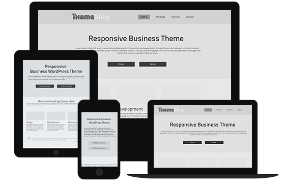
Once you’re happy with the homepage design you’ve come up with, the next step is to see how it’d look like in a diminutive phone screen. Mobile internet traffic is now bigger than desktop internet traffic and your priorities should adapt accordingly. Check if your homepage looks and works as it was meant to on your phone in addition to on your computer. The easy way to do this is by using a responsive design, where the webpage adapts itself to the size and orientation of the device it’s being displayed in without you having to manually adjust every element of the page.