Filling In: 4 Online Form Builders You Could Use for Your Website

web development tips

Back when I was still in college, my university has this thing where in order for students to see their grades online, they are first required to fill out a questionnaire related to that particular class and the teaching professor. The questions are typical but they’re numerous and since we have to do this for every class we take that semester, we pretty much skimmed through all of the questions and went with the default answers.

Forms are inescapable on the internet. Almost every concert tickets I’ve ever bought began with a form. Product giveaways tend to have a survey as a prerequisite. Even now, 5 years since leaving college, the odd questionnaires and surveys still land on my inbox, usually from undergraduate students from my alma mater. A lot of these came through Google Forms, which is functionally decent but for businesses aiming for professionalism, there are other form builders out there you could use that don’t require any web development background.

The landscape for online form builders

For the purpose of lead generation, forms and surveys are still deemed to be one of the most useful tools. Compared to two decades ago when surveys have to be done directly through visits or telephone calls, the internet has made data collecting easier, giving businesses access to a more robust set of data. With the advent of services like PayPal, digital subscriptions have also been made more accessible, enabling people living in Gold Coast to subscribe to the New York Times by filling out a simple form.

It is in light of this that you should start giving forms a proper consideration. The familiarity and ease-of-use associated with Google Forms might be attractive but its blandness and lack of customization options can be crippling. The following is 5 form builder services available across the internet, with a mix of free and premium services, which you should take a look at if you feel Google Forms isn’t enough.

JotForm

American-based JotForm is one of the most popular form builders. With JotForm, users have the option of using one of the plethoras of templates and themes available within the platform or by building their own form using a selection of several building blocks available within the platform. JotForm also enables the use of conditional logic and branched-out forms for a more complex data gathering.

The service operates using both a freemium and tier scheme. While most of the templates and themes available are free, some of the higher-quality ones are not. Additionally, while it is possible to use the service without a paid subscription, free users are limited to 100 monthly submissions, 5 forms, the addition of JotForm branding on your forms and other restrictions.

TypeForm

For the more artistic types, you should consider using TypeForm. TypeForm realizes that there aren’t a lot of things that could be more mind-numbing than filling out a form and they subvert this idea by turning forms into more of an extended conversation. They do this by focusing only on one question at the time and allowing users to attach multimedia contents into the form itself. The name itself comes from the fact that TypeForm is designed so that users can fill out the entire form by simply typing out their answers.

TypeForm operates using a tiered scheme. The basic version is free to use but comes with a restriction of 100 responses per month and only 10 fields per form. Other restrictions include being limited to basic questions only, the use of conditional logic, payment field and no file uploads. The Pro tier comes with all of those for an extra US$30 per month.

Ninja Forms

Ninja Forms isn’t a full-on form builder in that it is actually a WordPress plugin, which means that this tool is limited to WordPress websites. Since it’s a WordPress plugin, Ninja Forms should be considered one of the default options for WordPress website thanks to its integration capabilities. Ninja Forms comes with support for robust customization options and the ability for more complex fields available out of the gate and the use of drag-and-drop form builder.

Ninja Forms pricing plan is a bit trickier though. While the free version comes with the above features, some customization options like conditional logic, payment options and file uploads are locked behind a paywall. Instead of a tiered subscription though, these features are locked behind add-ons, which you could purchase one at a time to use for a year. Alternatively, some of these add-ons are also bundled together for those looking for a more conventional subscription scheme.

WuFoo

Now working under the analytics company Survey Monkey, WuFoo offers robust collecting and analytics tool on top of the more common features like payment options and conditional logic. On top of that, WuFoo also offers the capability to create a device-responsive form, one that could suit both desktop and mobile devices for a more comprehensive set of data. To add to its analytics capability, WuFoo offers integration with CRM software maker Salesforce for comprehensive reports.

Of course, these features don’t come cheap. The basic free version is limited to 5 forms and 100 submissions with a lack of payment options, confirmation e-mail and feature integration. These features are available with a Professional subscription, which comes with a price tag of US$29 per month.

It should be noted that these are all for forms, which while still can be used for surveys aren’t especially suitable for the cause. For surveys, you might want to look at dedicated survey tools like Survey Monkey which has been mentioned before. Filling out forms can be boring but it doesn’t have to be and all four on this list, with special mention to TypeForm, can be used to inject a certain class to your lead generating tool.
Create A Great Customers’ Online Experience to Boost Your Business’ Credibility

web design tips

When it comes to the business world, many business owners know that in order for people to find and know about their business, they have to make a website to keep in touch with their audience. For that reason, most business owners start hiring people to design their website. With so many web design ideas and concepts nowadays, sometimes you may get the results you want, and sometimes you don’t get anything, but penalty from search engines. Why does this happen? Well, there are many possibilities as to why this happens, but most importantly, it may come from your website design. Non-friendly websites may cause the worse online experience for the audience, resulting in search engine’s penalty giving those websites “warnings.” With that in mind, how do we create a great customers’ online experience? Keep reading this article to learn more!

Appearance

When users first visit your website, they sure will have the first impression of your website. That first impression may be the very last impression if your website is not user-friendly. There are some ways you can choose to make your website easy to read and understand:

  • Responsive design
  • Bold fonts
  • Eye-catching images
  • Multimedia

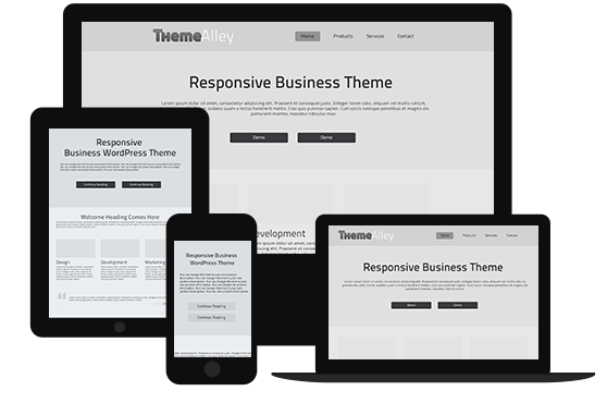
Responsive design means that the size of your website is adjustable when being accessed through any device. Also, using bold font is another way to make your title easily readable; however, make sure you have easy-to-read fonts on your site. Including eye-catching images and a little bit of multimedia is also nice for making the best first impression. Make sure you adjust the size to any device and optimise the images and multimedia so that they won’t hinder the progress of your website because of the inaccessibility or slow loading pages.

Professionalism

Aside from entertaining your customers or audience through your website’s appearance, showing them your professional side is also a professional move. Here are the things you can do to make sure your audience trust your business:

  • Include photos of staff
  • Put your previous customers’ reviews
  • Include culture page

While it may seem to be so simple, including photos of staff can make your customers believe that your business really exists. Aside from that, you should also put customer reviews on your site in order to show your business’ credibility. That way, your potential customers will be certain in their decision to make a deal with you.

Easy navigation

There is one thing that too much attractive websites often forget to focus on; navigation. When the website is too attractive, the designer often forget the crucial part of a website; the easy navigation. I know I have mentioned that two times, I just want to make sure. So, what do I mean by “forgetting to make easy navigation”? Oftentimes, too attractive websites may be difficult to access because people don’t understand the complex navigation, which can result in them leaving your page because it is too complicated. For that reason, it should be noted that in order to create a great customer’s online experience, you must keep it simple but still being attractive at the same time.

That’s how you create a great customer’s online experience! Hope you enjoy reading our article and get more knowledge from this! If you need more information about web design, feel free to contact us and let our creative team help you with your business’ website.

How to Boost Email Conversions Using These Copywriting Techniques

seo techniques

Emails are used for interacting with friends and family back when it first started being used as the alternative of sending messages aside from the traditional letters. Now with the more developing and constantly changing technology, emails are now used for marketing too, so that business owners can find opportunities to promote their business. Of course most of them know the important use of SEO services for business. For that reason, combining marketing strategies with SEO techniques is advisable, especially for marketers. Using the right copywriting techniques, business owners can generate results from email conversions. This article will tell you how to boost email conversions using the right copywriting techniques. Keep reading to learn more!

First step: write a minimum of 3 email versions

I have always seen many people write emails with the same technique, the same plot, and only one time before making it the final draft. One most important thing in copywriting is to get creative to produce the variety. Get creative and combine ideas, you can start by writing a rough draft and create variations or versions. Make until you have 3 versions and evaluate them. Combine the 3 ideas into one additional (but final) draft. The point is that you have to keep revising and evaluating until you are satisfied before you send the email to your audience.

Make the email audience-focused

When you write emails for your audience, you have to keep focusing your intention to your audience, because when they read your email, they need to know if what you are offering them can benefit them or not. Focusing on your audience’s need is a good start in writing emails for them. If they find your offers interesting and able to give them what they need, chances are, they will accept your offer.

Call-to-Action to get into action

Another important part in email marketing is Call-to-Action (CTA). There are many ways to conduct CTA methods, but there are things that you need to know in order to create CTA best practices:

  • Only use one CTA button, as you don’t want to confuse your audience by giving them two options – your option needs to be clear and simplified.
  • Tell your audience what they are getting by clicking the CTA button, not what they are doing, because it would be just a waste of time if they don’t know what the benefits they will get through your offer. So, instead of a “download now” button, try “Enhance your inner beauty with this product” or “Let this product amaze you.”
  • The main CTA button should be placed toward the end of the email. Placing the CTA button in the main body will only make your audience sceptical to your products. In here you should use your copywriting skill to create a captivating argument that will help your audience overcome their purchase hesitations. Using CTA button in the end of the email will give the final blow that pushes them to be very certain to click and complete a purchase.

That’s how copywriting skill is used not only for interacting with your audience but also for email marketing campaign that will be a booster for email conversions. If you need more information about email marketing, feel free to contact us and our creative team will gladly help you.