Simplifying Choices: How to Take Advantage of Hick’s Law in Web Development

web development tips

The only thing worse than making a decision for people dealing with anxiety is making a decision where there are more than a dozen options available. While thankfully not all of us have to deal with severe anxiety issues all the time, I’m pretty sure there was at least one point in our lives where we were overwhelmed by the choices that are presented to us. I’ve been there plenty of times when trying to book a hotel for the holidays, when trying to pick up a new pair of jeans and when digging through the thousands of video games that are on sale during Steam’s annual summer and Christmas sale events.

Variety is indeed the spice of life but just as how things are when you’re cooking, it is actually possible to overseason your dishes. Everything should always be in moderation and sometimes, putting a limit on the options that are available to customers might actually be a good idea. Too much of everything can lead to anxiety, indecision and eventually, to lost sales. Obviously, this is something that every business would very much like to avoid, resulting in the application of Hick’s Law in the world of web development.

Simplifying the decision-making process

Also commonly referred to as Hick-Hyman Law and first theorized by psychologists William Edmund Hick and Ray Hyman, Hick’s law posits that the time it takes for a person to make a decision depends on the amount of available options and increasing the number of choices will increase the decision time on a logarithmic basis. There’s actually a mathematical formula that details this law in greater detail but in this piece, I’m just going to focus on the big picture. Hick’s Law sounds maddeningly obvious but in the pursuit of offering the most comprehensive list of features, this law tends to get overlooked by web designers and developers.

As a business owner, you’re regularly advised to cater to everybody’s needs and at its most basic interpretation, it does seem that Hick’s Law explicitly argues against that idea. On the surface, that might be true but in practice, there’s more to Hick’s Law than just simply reducing the number of available choices. The ultimate goal of Hick’s Law is to simplify the decision-making process so that even the most complex of decisions and/or actions can still be executed without laboring of what this or that will do.

In interface design, this idea manifests as the acronym K.I.S.S. or “Keep It Simple Stupid”, pardon the language. In certain cases, there would be no simply avoiding complexity but the challenge lies in making that complexity accessible. Manual controls in any kind of camera is comprehensive by design and removing that level of comprehensiveness would defeat the point of manual controls entirely so you’re going to have to figure out a way to ease users into the process. In the world of web development, the gentle hands of Hick’s Law could be used in several different ways.

Introduce everything in bite-sized chunks

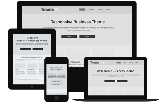
In an e-commerce platform for example, instead of just simply adopting a free-for-all approach, you’re going to want to use proper categorization for your products so as not to overwhelm your customers. First, you start with category A, B and C. One users picked category A, they’re presented with category AA, AB and AC and this continues until said user would be able to find exactly what they’re looking for. Using this categorization approach, you could have thousands of available items but users would have the option of viewing only a dozen of them at any given moment, which makes it that much more manageable.

Another way of adopting this bite-sized approach is to introduce everything in a series of steps. This is very important in a checkout or a registration process where instead of presenting every forms and boxes a user have to check, you divide them into a series of steps and left out the unnecessary information for later. If there’s anything the human race have in common, it’s our disdain for bureaucracy, standing in lines and filling forms and anything you can do to make them as painless as possible would definitely be appreciated.

Hide the complexity of your interface

Just as how we’re advised to not find out how sausages are made, businesses should endeavor to keep the complexity of their system hidden from view unless the user specifically requests to see them. For example, manual controls in mirrorless cameras are typically hidden from view unless the user specifically chooses to enable manual controls. Just as with cameras, you want to keep unnecessary customization options hidden from view, at least at the beginning, to keep users from getting overwhelmed.

Make it so that each option is clearly distinct from each other

It’s pretty common for businesses that in the interest of covering their bases, they end up offering several options to users that are too similar to each other. This isn’t practical in two different ways since it could lead to your products cannibalizing each other’s sales and could very well end up confusing your users. To alleviate this issue, offer users with several pre-packaged selections and then provide extra customization options inside the product page using the approach described in the previous section. This way, you could satisfy users that are looking for something simple while still satisfying those that are looking for more granular options.

Manipulating Size and Space: Using Fitts’ Law to Improve Usability in Web Development

web development tips

You might’ve noticed for a while now that only the space bar is given prime real estate space in your computer’s keyboard, right down in the bottom middle are; it has also been made bigger than any other keys. This isn’t without reason as the space bar is typically one of the most frequently used keys in a keyboard in any given setting and all ten of your fingers need to be able to reach the space bar quickly and easily. This design makes typing easier and more comfortable for all of us and the reason why even in vintage typewriters that doesn’t have a space bar, the space keys are usually hard to miss.

This manipulation of size and space is based off of a predictive model of human movement in the field of human movement and ergonomics referred to as Fitts’ Law. In the field of man-machine interface, of which web development and UX design is a part of, Fitts’ Law is used to give more prominent to functions that are more important or more often used than others. As is the case with the humble keyboard, Fitts’ Law can be used to improve the usability factor of your website, making it a much more hospitable place for users, which is the ultimate goal in UX design.

Fitts’ Law in a nutshell

The gist of Fitts’ Law is actually pretty simple. The law predicts that the time required to move to a target area is a function of the ratio between the distance to the target and the width of the target. The space bar is an example of Fitts’ Law being utilized to the maximum and if you take the time to observe the world around you, you’re going to find more example of Fitts’ Law being used. In cars for example, the brake pedal is always bigger and easier to reach than the accelerator so that under emergency situations, you could easily stop your car from whatever it is you’re about to run into.

Car pedals don’t take into account the possibility that you might actually have to outrun something but that possibility is far more remote than having to stomp on the brakes. In a man to machine interface, this is referred to as a hierarchy, where the amount of visual weight is given based on the function’s importance or likelihood to be used. We’re far likelier to run into something than having to outrun something and this simple reason is why the brake pedal takes priority over the accelerator.

In the field of web development, Fitts’ Law main priority is to improve usability but the law is often used for the purpose of marketing as well. By subtly altering how elements are presented in a webpage, it is possible to subtly nudge users into performing certain preferred actions with the keyword here being subtlety as blatant sales tactics can and do impede usability. Fitts’ Law manifests itself in several different ways in web development and you want to pay extra attention to the following methods.

Buttons should always be easily clickable

The easiest way of making buttons clickable is by increasing their size but buttons could only get so big before their size becomes an usability issue. You want them to be easily clickable yes but there are other ways you can do that other than having to rely on size. To begin with, you can establish clear boundary with the space around them by making use of contrast. Black buttons over a white background for example would be hard to miss and you can also make it so that the CTA buttons aren’t immediately surrounded by other distracting elements, which leads to my next point.

The issue of space and distance

Another way of making buttons more prominent is by making sure that they’re not surrounded by other elements. Google’s homepage for example is still solely dedicated for search with other Google services hidden in the menus. By isolating your most important CTA button in a section of the page where they can easily be seen, you can subtly direct user’s attention to that button. This is a good thing for usability as well as you don’t want buttons on your website to be too closely grouped with each other as you don’t want any misclick to happen, especially for buttons with opposite functions.

On the other hand, for buttons and functions that are related to each other, you want to group them close to each other. The username and password field is always located next to the login button as they’re directly connected to each other. For related buttons, you want to make sure that they’re clearly distinguished from each other by using proper borders. This is especially important with mobile interface as space is even more of a commodity in that field.

Give ample clicking space

If your website make use of forms in some way, and it probably does, then you’re probably going to make use of radio buttons at some point. Now, radio buttons tend to be annoying because they have a very small amount of clickable space and it’s not rare for me to feel like I’ve clicked on that button only to find out I’ve missed it by several pixels. To alleviate this, you might want to consider making the label clickable as well, but ensure that this information is presented to users so that they don’t waste time aiming for those teeny-tiny radio buttons even when there’s ample clickable space sitting next to the radio buttons.

How to Boost Your Sales Through These Colour Psychology Tips

web design tips

I have to admit, as a person, I’m not into colourful things. I always love black and black is the only colour I love. However, in the business world, it doesn’t work like that. Colour is the face of a business that represents its “personality” and “uniqueness”. If you are a business owner, I’m sure you know the meaning of colour for your business, especially when it comes to web design or logo design. Colour is the characteristic of your business that can differentiate you from other companies in the same industry. The set of colours used in business may be the same and identical; however, there is the psychology behind the meaning of colours and depending on what you choose; it can determine your business success. For that reason, if you are just starting out a business and building your website, you should make use of this colour psychology that can help you attract more customers and increase sales. How? Keep reading this article to find out!

What is colour psychology?

Before we dive deep into more information about colour psychology, let’s start with the definition first. Colour psychology is the science of how colour affects human behaviour. Although this lacks scientific evidence to back up the theory that colours affect human behaviour, there are key facts of colour theory that cannot be denied. In a peer reviewed journal article, Satyendra Singh determined that it takes a mere 90 seconds for a customer to form an opinion about a product and 62-90% of that interaction is determined by the colour of the product alone.

Where should you use colour?

Colours are omnipresent. They are used everywhere. For that reason, you need to understand where you should use the colours for your business and since we are talking about colour use in web design; you should use the colour scheme of your website that includes the tint of headline type, backgrounds, popups, borders, hero graphics and buttons.

Use the right colour in the proper way

Colour is tricky sometimes. Each colour has different meanings and effects. That’s why you should use it properly, at the right time for the right purpose and the right audience. For example, your business is selling toys for kids, your ideal colour scheme would be bright yellow, bright green, bright blue and a little bit of a red for some important part like contact details to make sure the buyers find them easily. If you are selling beauty products focused for women (yes, skincare stuff can also work for men, but that’s not the point in this example), then the colour scheme that works well for your products is a set of purple, soft pink, light purple and a little bit of white for the text can work too. However, keep in mind that it also depends on your products. If your beauty products are from the same brand with the same colour and let’s say the product packaging’s main colour is blue, then you can’t use colours like pink or purple. Use blue and expand its colour scheme with blue as the main focus colour so you can adjust your product well to the design. If blue is the main colour, you can use a set of dark blue, light blue and white. Doing this will help you maintain consistency for your brand and help your audience recognise you.

Colour and its effects

Now we get to the part where colour has its meaning and effects on other people. Colours have direct or indirect impacts on each person who sees that. These are the meanings of colours in general:

  • Black means mystery, elegance, death, evil, power, mourning
  • Blue means sadness, calm, loyalty
  • Green means abundance, nature, freshness
  • Yellow means happiness, concentration, hope
  • Red means passion, anger, danger, love
  • White means purity, cleanness, innocence
  • Purple means royalty, luxury, wealth, sophistication
  • Cream means elegance, purity
  • Grey means conservative, formality

Ever came into a room and immediately felt relaxed? Maybe a place like Spa can remind you of the feeling of relaxation and freshness. Perhaps the place is coloured in green, blue and a little bit of white? Yes, colour has THAT kind of effect on people. For that reason, business owners make use of colour psychology to determine which colour is suitable for their business and values. Remember, colour matters because your business matters; therefore, choose wisely.