Calling Card: 4 Reasons Why Every Business Website Needs a Logo

web design tips

First things first, let’s get it out of the way that I decided to write this thanks to the news about Persona 5 Royal, an upcoming enhanced edition of the 2017 hit video game Persona 5. In both games, you control the ringleader of a high-school vigilante group, nicknamed the Phantom Thieves, that tries to change the hearts of corrupted adults by invading their subconscious realm known in-game as the ‘Metaverse’ and stealing their ‘Treasure’. I know, it’s quite a lot to process, but what I would like to draw your attention to is how the Phantom Thieves operate.

Before each heist, the Phantom Thieves sent out a calling card emblazoned with their logo of a party mask wearing a top hat and the words ‘Take your heart’ written on the card. Persona 5 is a uniquely stylish game and this calling card and the Phantom Thieves logo is a huge part of that style. The visual styling of the game and the dominant color scheme of black and red used in the game is reflected in the logo, which practically represents the identity of the overall game. This reason is what makes the logo so important and why, in terms of web design, it’s important for a business to have a logo.

The purpose of a logo

A logo isn’t exactly a piece of art nor is logo a bland mark of identity the way barcode is; it’s a combination of both. A logo has to be visually distinctive and representative while still being visually appealing. The uncultured probably has no idea why the Starbucks logo is that of a mermaid but anyone who’s ever read Melville’s seminal book, Moby Dick, knows that Starbuck is the name of the first made aboard the Pequod, the whaler captained by Ahab in his pursuit of the titular whale. The mermaid is just a natural extension of the nautical theme carried by the name.

The name and the logo don’t really have anything to do with coffee but it was unique and distinctive enough that even a mere glimpse of the logo would lead your brain to connect it with Starbucks. It’s not the coffee or the pumpkin spice latte that makes Starbucks, Starbucks. It’s that mermaid staring at you from the side of the cup, which is exactly what the logo was designed for. Your logo is the leading protagonist when it comes to your brand identity and this one fact results in 4 different reasons why your logo is essential to your website

Your logo dictates the overall styling of your website

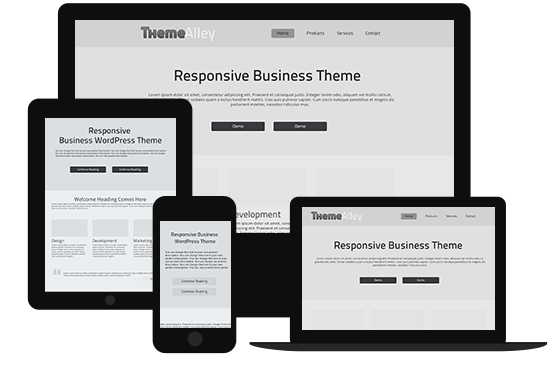
Just how the dominant color scheme displayed in Persona 5’s calling card reflects the entire video game; the aesthetic of your company’s logo forms the aesthetic foundation of your web design. The Starbucks website for example features the color green in a dominant role and the website for the sandwich chain Subway also features a highly visible green and yellow color scheme. Color is just one easy example of how a logo could affect the overall design of your website but other factors could also be affected.

For example, it is possible that the typeface your website is going to use relies on your logo. In the website for Persona 5, the typeface used for the headings is identical to the one used in the calling card, which is similar to the cut-and-paste letters typically seen in ransom notes. The logo represents the core identity of your company so it only makes sense for your web design, which forms the digital representation of your company, to take after the identity of your logo.

The logo act as the compass in your website

In pretty much every website I could name, clicking on the logo would take me to the homepage of said website. A logo isn’t there just for simple eye candy, it can also perform specific functions; as a mark of consistency in your web design and to provide users with a specific navigation tool. Just as how a compass would always point to the magnetic, not geographic, North Pole of this planet, the logo should always lead to the homepage of your website. It’s also important to make sure that the logo stays on the same position in every single page of your website to ensure consistency.

For the purpose of branding

The Ferrari is commonly referred to as ‘the prancing horse’ thanks to their logo, taken from the emblem of Italian WW1 ace pilot Francesco Baracca. The Italians are particularly smart when it comes to branding as Lamborghini typically names their car based on Spanish fighting bulls, which also happens to be their logo. When used intelligently and in conjunction with other parts of your business, your logo could be used as a unique branding opportunity since your logo is unique to your company.

It’s what the audience expects and sometimes demands

As of now, whenever I’m looking for a new pair of jeans, I always try to look for brands with a signature back pockets. Other than the fact that these back pocket stitching could help imbue a pair of jeans with a semblance of life, I also like it when a brand has their own mark of identity they use on their products. This is why it’s important for a business to have their own logo proudly displayed on their website as it’s a visual identifier that is now pretty much expected by the audience and in my case, demanded.

The Most Engaging Types of Digital Marketing Content Your Audience Will Absolutely Love

content tips

When you are in a happy relationship, the problem is not about if your partner loves you or not. It is more about whether your relationship will stay that way or end quickly. Sometimes we can get something so easily, but preserving the value is another story. The real example I can give you is; a trend. It is so easy for a popular product to be the hype in the industry, but so quick to disappear once another new hyped up trend comes in. It is easy to spend money for shopping, but it is hard to manage it. As a person who works at a creative agency that provides web design, web development and SEO services as well as other services that can help clients’ business grow, my hardest challenge of keeping up my good work is how to keep audience interested in my content so that my clients will find more new customers as well. That being said, with our team’s hard work, we have succeeded in keeping our clients satisfied with our work by using more engaging types of digital marketing content that will keep audience entertained and of course they will absolutely love it. How? Keep reading to find out!

Videos and motion graphics

Be honest with me, when you see some content, which one would you prefer; video or text? I absolutely love videos and motion graphics and I’m pretty sure many people would choose videos over text. However, there is one thing you should understand when it comes to having video as content; the way you engage with viewers in that videos or motion graphics. I always go to YouTube to watch videos about life-changing lifestyle tips, but I don’t like the type of video where a man or a woman just talking about some tips in the video without including tools or aspects that can engage and interact with viewers. I always love watching content from Improvement Pill on YouTube. Instead of flat out talking about tips, they use graphic motion and great animation to boost the explanation and turn it into entertaining education. Sure you can still use the usual real-person video, but make sure you add fun stuff in it.

Infographics and social media micronarratives

Static content is a powerful tool for capturing and keeping audiences’ attention. On social media, share small snippets of information like fascinating graphs, for example, that can stand alone in posts. Using mini-infographics can also drive traffic to full-length infographics living on your site or blog.

Interactive infographics

According to Demand Metric, interactive content can boost a 70-percent conversion rate. That’s because interactive infographics, widgets, landing pages and more can help viewer personalise content for themselves. BuzzFeed’s famous quizzes are the good example for that. I for one am fond of their fun quizzes. I love it when I visit an online shopping website with features like interactive infographics or quiz because it is more effective to help me know useful things about myself and find what kind of products that are suitable for me.

Even though there is nothing wrong with using text for content, too much of it can make the content dull and lifeless. Engaging types of digital marketing content like those I have mentioned above can help you communicate better with your target audience as well as boost their interest in buying your products or hiring your services.

Retail Development: The Importance of Proper Web Development in E-Commerce

Retail Development The Importance of Proper Web Development in E-Commerce

On any given day, I spend probably 3 to 4 hours tinkering with a user interface of an e-commerce website. I might be simply browsing what’s on sale on Steam, salivating over the dozens of terrific watches from NOMOS Glashütte or just checking out for new jeans because you could never have too many pair of jeans. Two decades ago, doing any of the above things would require me to walk into an actual store and do some window shopping, the progress made in web development in the past 20 years means that I now can do all of the above things while sitting in my bathroom.

What this shift means is that the time businesses used to spend on coming up with just the perfect layout for their store now should be spend on coming up with the ideal website for their business. Functional should be the minimum requirement, not the ultimate goal, and if there’s anything you can do or add that would make the website more appealing or easier to use, you should definitely give it a shot. Now that small businesses are dime a dozen, it’s not enough to have a great product line-up, the importance of having an equally great space to house all of those products should never be underestimated.

The digital store layout

It turns out that I apparently have a relatively higher standard when it comes to store layouts as I once walked out of a fast fashion retail store once it became clear to me that whoever designed the layout must’ve done that under the influence of at least a dozen shots of tequila. I know that people like to say that visiting the actual store makes for a better shopping experience but from what I’ve seen from the typical retail stores, that hasn’t always been the case. There are some genuinely great ones but those are usually the exception instead of the norm although that could simply because of my high standards.

This is not to say that the landscape in e-commerce is perfect, far from it in fact, but if you came across an e-commerce website that you deem to be subpar, finding an alternative is simply one new browser tab away. In the physical space that would mean more walking and that’s not always welcomed. This sheer convenience is why e-commerce has been slowly but surely killing the once-ubiquitous retail space, as can be seen in the dozens of abandoned malls in America.

One downside (or upside, depending on your perspective) of this new normal is that it has made the playing field considerably more equal. In the bygone era of physical retail, big brands have the advantage of putting their products in front of the highest amount of people possible while small businesses with meager resource don’t have that kind of luxury. With the era of e-commerce, even the smallest of brands could have their moment in the sun with their very own website and the competition would be in which business have the ‘best’ website based on the following characteristics.

How easy is your website to navigate?

Near where I live, there’s this new-ish rooftop cafe that became one of my favorite places to hang out with friends. For one, they serve all-day breakfast and one of my lifelong dreams is to be able to eat eggs benedict three times a day. Secondly, being situated on a rooftop of a six-story building in the suburbs, they have quite a lovely view. They have a private elevator for access but the problem is, back when the place was first opened, there were no signs indicating that you have to use the elevator to get there, which was quite confusing when I invited some friends for a gathering of sorts.

They’ve changed this and now there are signs indicating the way to the elevator all the way from the entrance to the building but this analogy illustrates the importance of navigation. If potential customers can’t find what they’re looking for in your website just from a glance, you’ve got your work cut out for you because the back button is always accessible. This is one reason why minimalist design has started to become the norm; it won’t be hard to find what you’re looking for when there’s very little on display to begin with.

Don’t make your customers jump through unnecessary hoops

Forgive me if I’m boring you with anecdotes but here’s another one. A female-friendly bar just opened near where I work and a close friend asked me to check the place out because she’s an attractive woman and whenever we’re out in a bar, she always have to deal with unnecessary attention. The bar had a pretty great atmosphere and the pink decor was chic without being girly and we had a pretty good time there, at least until we wanted to close the bill. Apparently, they had a problem with the system and since we didn’t have enough cash on hand, we had to walk to an ATM a couple hundred meters away. Needless to say, I doubt we’ll be coming back in the near future.

The main thing that makes e-commerce so attractive is the sheer convenience inherent to the practice and businesses has to do everything they can to make the process as seamless as possible. Try to include as many popular payment options as possible and don’t ask for more data from your customers than necessary. Additionally, make sure to include supplementary information about the product to spare potential customers the burden of having to ask for additional information.

Aesthetics should take a backseat

In an e-commerce website, the product and the accessibility of the website should always be the priority. This isn’t to say that the aesthetics of the website should be neglected but you have to make sure that they won’t overwhelm the two things mentioned above. Ensure that the designs remains consistent and clear across all sections of the website and then you can worry about additional adornments. Once you’re done with adding those little touches, check to see if they’ve made the website any less usable. Once you’re confident they haven’t, you can then call it a day.