The Mistakes of DIY Approach on Web Design for Small Business

web design tips

There are many things in the world that you can do yourself. The healthy drink you usually buy from the supermarket? You can actually make your own healthy drink at home. The Vietnamese spring rolls you usually order in the restaurant? You can make your own Vietnamese spring rolls. The skincare products you usually buy in the department store? You can make one too for yourself. Face toner can actually be made out of a mixture of water and rice – the rice water can simply be your face toner. The concept of self-made creations has been popular among YouTubers and social influencers thus came the term “Do It Yourself” or in short, “DIY”. The DIY concept is usually done in order to reduce expense and promote more natural self-made products that are environment-friendly and chemicals-free. One of the common examples I can provide you is how Vloggers post videos of them showing how to make DIY skincare products. While this is easier, cheaper and more efficient, there are also the drawbacks of making things on your own. In this case, if you make your own skincare product without the professionals’ supervision, you may not know what your DIY skincare product might do to your skin. I think the same concept and perspective can also apply to web design. Almost all business owners know the importance of having a website for business. However, due to the cost of web design and web development process that may be higher than expected; some business owners prefer to make their own website – their DIY approach on web design to cut their budget. That being said, this can both make and break the business. While DIY approach on web design may cut your budget, this can also backfire you in the long run. Why? Keep reading to know what kind of mistakes you could make if you apply the DIY approach on your business web design.

Poor site structure and navigation

A novice designer will often choose templates and themes purely based on how they look. However, some unique and good looking design can also be the most confusing when it comes to navigation, and this is bad for both your SEO and your UX. When you create a site yourself, navigation is actually considered one of the hardest aspects to get right. Unless you graduated from graphic design department in your university, then it is more advisable for you to hire a professional web designer.

Slow loading website

Non-expert person who tries to do web design will usually not be aware of the fact that some designs are going to cause slow loading on website’s pages. If you want to design your own website, you must have experience with compressing images, limiting server calls, or using caching; otherwise, the speed of your site will undoubtedly suffer. A professional knows how to manage all aspects of website development to make sure the page speed and loading times is user friendly.

Negligence in making responsive website

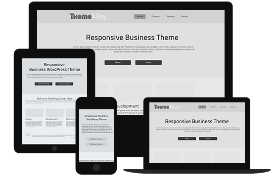
Most people who don’t know the first thing about website often only see ‘looks’ instead of optimising both ‘looks’ and ‘functions’. When you are visiting a good looking and uniquely designed website, you may often think, “Oh, I want my website to look like this too!” and so you came home trying to make it. However, what you fail to see is that the website you have visited may or may not be indexed by Google for certain reasons. One of the reasons is whether or not that website is responsive and adjustable to any device. This is why leaving web design to the professional is the best bet you can ever make.

Although a DIY web design approach can work, you still have to be aware of some of the common mistakes and really think about where you see your company in a few years as well as think whether or not this is easy for you. In most cases, spending the money now to have a great website that is ready for growth and can draw your readers’ attention is going to be well worth it in the long run, instead of creating your website yourself and having to make changes later.
Solo Soujourn: The Significance of SEO for Startups

SEO tips

Working for a startup is never easy. I don’t mean the fact that you’re probably going to put in considerably more hours than the average or the fact that you’re going to be 90% reliant on a series of funding just to stay afloat. No, I’m talking about the fact that whenever someone asks you what you do for a living, you’re going to have to be prepared to give a long answer. If you tell people you work for Commonwealth Bank or Qantas, they could immediately understand what it is but if you mention you’re working for a no-name startup, you’re probably going to be asked the details of what you actually do.

I’ve seen this happens to an ex-colleague of mine even when the startup he went on to work for isn’t without cachet. Some startups are constantly in the headlines, the Ubers and Spotifys of the world basically, that mentioning their name would be more than enough but most aren’t so lucky to have that kind of reputation. This lack of reputation can also be a professional obstacle as it’s difficult to showcase your capabilities when they don’t even know who you are, which is why SEO and SEO services can be such a boon to startups, especially on the earlier stages of their lifecycle.

The concept of a digital public square

Three decades ago, whenever you are in need of something, you browse through the yellow pages or ask friends, families and neighbors to find what you were looking for. In 2019, as long as you have a working internet connection, all you have to do is open a browser and type a search query. If you feel like talking to a person, you could simply access the various forums or subreddits online for information on what you need. The point is, you’re still going to be using the internet anyway.

This is also the reason why conventional marketing is no longer as effective as it used to be given that we now spend the majority of our free time online. If prime marketing space in the 80s is defined as somewhere with large foot traffic like the Federation Square in Melbourne or a hit television show such as Neighbors or Home and Away (I’m just spitballing here, I was born in the 90s), today’s prime marketing space in the topmost result in the first page of a search engine results page (SERP).

The tricky thing with the prime marketing space we have right now is that money wouldn’t be enough to get you into the first page of Google’s SERP; it’s SEO that going to get you over the finish line. When you look at it this way, SEO is important for every business but startups and by extension, small businesses, are in a unique position that makes SEO more or less necessary to their success or even survival, as will be explained further on.

Startups and small businesses can’t rely on word-of-mouth reputation

If I wrote the word Apple here, even if I wasn’t directly referring to the Cupertino company, the tech giant is still going to be the first thing that comes into your mind. Use that word in a conversation and the people you’re talking with would still be able to catch on to what you were referring to. Google too has become so ingrained in our lives that the company’s name is now being used regularly as a verb as a code to look something up on Google search like we used to but with a dictionary.

This brings me to the point I was trying to make at the beginning of this piece, about how name-dropping a startup company would simply lead to more questions and how it might be of a problem, professionally speaking. SEO helps startups sidestep around this issue because there’s something trustworthy about a business that is featured in the first page of a SERP. It helps foster credibility and build your reputation even before potential customers know exactly who you are.

Results from SEO take time

Another reason why SEO is important for startups is that it allows you to start fresh and early and reap the results of your SEO efforts when your business is in the growing stage. The results of your SEO efforts is proportional to the time you spent making that effort and by starting as early as possible, you could possibly get a headstart on some of your competitors who might not be as forward-thinking as you. Rome wasn’t built in a day, which is why it’s important for startups to begin considering putting some of their resource, no matter how small, on SEO as early as possible.

SEO could function as market research

While at its core SEO is about making you as high as possible on a given SERP, the research you’ve done as part of your SEO efforts can help shape how your business is going to look like. Both keyword research and content marketing, two fields that fall under the general purview of SEO, deals heavily on market research. Finding out what words people are using when it comes to your industry and keeping an eye out for trends that are shaping within your industry is the foundation of keyword research and content marketing and the information you obtain can help your business in more ways than just simple SEO.

It’s a way to size up the competition

One important part of SEO is opposition research. As a new business, you’re going to have to look into other established business in your industry and figure out a way to be one of two things, how you could beat them at their own game or how you could set yourself apart from the rest of the competition. That is true in your products and/or services and that’s also true in SEO as well. SEO is after all, a zero sum game, for a new company to rise up in the search rankings; another must go down as well.

With SEO, you’re going to have to figure out what keyword your competitors are using and then figure out if that specific keywords is the one you should be going for as well or to figure out another set of keywords that you feel better describes your business. The market is a very crowded place and the ability to think outside the box might be necessary. Optimizing for a popular keyword might not be the best way if you can find a slightly less popular keyword but with much less competition and this is where your SEO research could prove useful.

Autodidactisism: The Concept of Learnability in Web Development

web development tips

Give a man a fish, he’ll eat for a day; teach a man to fish and he’ll eat for a lifetime. Now that artificial intelligence (AI) development has ramped up considerably, various prominent thinkers have floated the idea of a universal basic income as one proposal to combat the potentially reduced amount of jobs that would be taken over by AI and that particular cliche has been on my mind quite a lot. The idea behind the quote is rather simple, instead of simply giving someone what they need, give them the ability to obtain what they need by themselves.

I like to think of myself as a progressive but perhaps because it’s because of the values my family have instilled in me, I believe in the idea of making a living out of an honest day’s work. Self-sufficiency has always been a concept that I found to be admirable, which is why the idea of a universal basic income isn’t something I’m ideologically on board with, even if I know it is somewhat inevitable. It’s also thanks this belief that I’m a huge proponent of the concept of learnability in web development and software development in general, as it promotes the idea of self-sufficiency on behalf of the users.

Learning the ropes in web development

You know how when you’re just starting out on a video game, you’re inevitably be presented with a tutorial of some sorts that shows you how to play the game? In the video game industry, this tutorial is usually divided into two broad categories, the hand-holding approach and the hands-off approach. The hand-holding approach takes its name from how parents usually hold their children hands whenever they’re together. In the hand-holding approach, players are practically infantilized in that the game basically tells them everything they need to do in order to play the game.

The hands-off approach uses a different tack in that it doesn’t force this information down player’s throat and instead acts more like general pointers that players are free to ignore. I’ve always despised the former approach because when a game needs to have its mechanics explained in full detail, that’s either a sign of bad design or a lack of faith in the developer’s part for the players. Good design shouldn’t be obtuse, it has to be something that is easily recognizable and learnable even without excessive hand-holding, which is where the concept of learnability comes in.

Websites are nowhere as complex or as interactive as a full-fledged video game but as technology progresses, websites now have considerably more features baked in compared to how it was a decade ago. Web developers then have to figure out a way to make sure that users are capable of using these features the way it was supposed to without excessively overwhelming them with tutorials and guides. This is especially important in web apps as they’re considerably more interactive than the typical websites.

Familiarity breeds security

If you’ve ever spent a prolonged amount of time away from what you refer to as home, then you’d no doubt be familiar with the idea of comfort food. For the South Asian diaspora for example, something as simple as a yogurt starter is enough for them to bring the comforts of their homeland into wherever they currently live. The usual insult thrown at familiarity is that it breeds contempt but it can also breeds security (and in the case of comfort food, affection) and this no truer than in the world of web and software development.

There are a number of free office programs you could use as an alternative to Microsoft Office but you would also notice that practically every single one of them uses a visually similar interface. I typically use Google Docs for my office needs but I also have Open Office installed for emergencies and moving between these two and Microsoft Office installed on my work computer is as seamless as it gets. The icons used are mostly similar and the options & features are located and labeled just as how I expect them to be.

The easiest way of making your website easy to learn is by following on what is considered best practices. A magnifying glass or a box labeled ‘search’ would be used for the search function. An image of a shopping cart opens up items that you’ve placed in your virtual shopping cart and an envelope, even though almost no one sends physical mail anymore, is used for the built-in messaging feature. Clicking on your username or profile picture would lead to your profile page. All of the above concepts are considered industry standards and to provide a seamless experience for users, don’t ignore them.

Use microinteraction features

You walked into an unfamiliar office building for a meeting on the 15th floor but when you pressed the elevator button, you noticed it doesn’t light up the way you expected it to. You automatically assume that the elevator is out of service so you tried the elevator on the opposite of the hallway and you noticed the same thing. You then asked the receptionist at the lobby if the entire elevator is out of service and then they answered that the elevator actually works, it’s just that the buttons don’t light up. Microinteractions are small but they are essential as is the case with elevators and for websites.

Microinteractions are the little things that act as a signifier to confirm that the user has performed a certain action. A filled heart sign when you liked a post on Instagram for example or things flying to your virtual shopping cart whenever you add an item in an e-commerce site. Microinteractions are useful to provide clarity as it could prevent users from performing the same action twice, something that I tend to do when the internet is spotty.

Always try to keep it simple

One thing I heavily dislike about reading fantasy books is that typically, even before I arrive at the first page and their plethora of made-up words, I’m going to be presented with a bunch of supplementary information that is central to the book’s lore. I find this to be seriously off-putting as the last thing any writer should do is to overwhelm the readers with information, and this philosophy is also true to the world of web development.

Always strive to keep your homepage simple, which can be especially important for e-commerce sites that feature thousands of different products. Web apps tend to be guilty of this as well, providing dozens of unnecessary options and features that might not be necessary to the majority of users. Having lots of features are great but unless they’re essential, hiding them behind a menu might be more preferable so as to not make your interface became too cluttered.