Quick Fix: 4 Tips to Increase Page Speed

web development tips

There’s this old adage that says patience is a virtue. In Japan, where waiting and queuing is less of a tradition and more like a badge of honor, there’s actually a phrase that refer to restaurants where the lines are long, “gyouretsu no dekiru mise”. There, waiting is the order of business for everything and the long lines have always been considered a status symbol for restaurants and retailers. When Japanese people are presented with two options, they’d go with the one having a longer line.

Sadly, this Japanese brand of patience and restraint has no place in the internet and web development where a mere 2 seconds is claimed to be the threshold for acceptability for an e-commerce page to load. In a society where everything can be accessed from anywhere and anytime and where page speed has been used as a ranking signal for Google, making sure that your website loads as fast as it should be is now a priority.

The importance of page speed

Even though 4G LTE networks have been widely available for almost a decade, the global penetration rate for LTE service remains relatively low. In North America, the most highly developed region in the world, the rate stood at 94%. In Central and Southern Asia, which includes India, one of the biggest mobile markets in the world, the number stood at an alarmingly low of 11%. In a region where population density is high, like downtown Mumbai, the lack of access to 4G networks could be detrimental.

It’s based on this reason why the Google-led Accelerated Mobile Pages (AMP) project was started, enabling near instantaneous access to webpages that conform to these rules. Other internet giants too have followed in Google’s footstep, with Facebook offering lite versions of both Facebook and Instagram mobile apps for developing nations. Norwegian company Opera too has a mobile version of their browser, the Opera Mini, which came with built-in features that automatically compress webpages.

When we moved the discussion to fixed networks, things are actually worse. Unless you’re living in Japan or South Korea, odds are you don’t have access to a fiber-optic broadband network. The two Asian powerhouses are the only nations in the world to have a penetration rate of above 50% for fiber-optic networks.

Considering all of the facts presented above, we can safely draw the conclusion that yes, page load speed is indeed important for websites. If you are unsure of how to optimize this or feel that you lack the necessary technical know-how, don’t be afraid as there are quite a number of simple things you could do to improve the performance of your website. Here are 4 of them.

Use Google PageSpeed on your webserver

Ask whoever is handling the hosting for your website to set this up. Per Google’s own word, these PageSpeed modules are “open-source server modules that optimize your site automatically”. That’s right, all you have to is install these modules and they’ll do all of the heavy lifting for you. Basically, these modules optimize your webpage by modifying the resources to comply with what Google considers best practices. It’s not magic, but it’s pretty close.

Optimize your images

There are two ways you can achieve this. The first and most simple way is to actually scale them down before you upload them. If you upload an image consisting with a resolution of 4000 x 3000, that’s 12 megapixels rendered in a 4:3 aspect ratio, but scales them down to 1200 x 900 to fit standard full HD screens, your webpage will still load the bigger original image before scaling them down, which is a waste of data. Resizing the image before it is uploaded would solve this problem.

The other solution is to use the many image compression tools available online. For WordPress, there are several different plugins available that do this automatically for every image you upload to the website. These tools are usually able to be fine-tuned, where you can strive for maximum compression, quality or a balance of the two. Some also came with resizing features, enabling you to combine the two methods to further optimize your load speed.

Use a fast web host

Not all web hosts are equal, and some are even more unequal than others. Due to the popularity of WordPress, powering one-third of all websites, there are a lot of web hosting services that are optimized for WordPress, which you should seek out if you belong to those one-third. Other considerations would be whether they offer CDN or not.

CDN, short for content delivery network, is a method of serving web contents to remote customers by making use of regional servers. For example, if your server is located in Australia but you serve international customers from Japan, a CDN could push your content into a server that is geographically closer, such as Hong Kong, to better serve that customer. Global content providers like Netflix rely heavily on CDNs.

Enable browser caching

Instead of asking your customers to load all of your contents every time they visit your website, browser caching lets you store some of your data in their computers, as long as their browsers allow them to. How long this data is stored depends on how you set it up and the configuration on your customer’s browser configuration. Just like Google PageSpeed, you should contact your web host services to set this one up.

A Google report from 2016 states that 53% of users ditch a website when it takes longer than 3 seconds to load on their mobile devices. Balancing this with the fact that you want to present your customers with the best content you could make is not an easy act. The 4 methods listed above should help you in optimizing your website without having to sacrifice the quality of your contents.
Flat as a Fiddle: 4 Benefits of Flat Web Design in 2018

Flat as a Fiddle- 4 Benefits of Flat Web Design

Just like the world of high fashion, web design has gone through several different trends during its relatively short existence. There was a time that simple flash animation was a pretty common sight on the internet. At the dawn of the 21st century, skeumorphism, a design language in which digital interface is made to closely mimic its real-life counterpart, a digital bookstore made to look like a bookshelf for example, briefly emerged as a leading trend before the world decided that a digital interface being limited to earthly restrictions kind of misses the point.

As a response to skeumorphism, the early 2010s ushered in a design trend that is still prevalent in today’s internet, referred to as flat design. Flat might be an adjective those in the music industry would like to avoid but it is actually one of the more functionally and aesthetically pleasing trend in web design. If you’ve ever used the oft-maligned Windows 8 OS, then you’re already familiar with how flat design looks like.

Flat design as a functional aesthetic

Flat design takes its name from the judicious use of two-dimensional characteristics, employing simple flat shapes as building blocks, contrasting color palette and noticeable typography to ensure a clean and minimalist interface. Flat design put its focus on the user’s experience. It aims to streamline user’s experience in order to provide optimum usability while still maintaining an aesthetically pleasing look.

Now, it’s true that the Windows 8 wasn’t favorably viewed by both the public and critics when it was first released but that’s more because it wasn’t a particularly good fit for mouse & keyboard users. Use it on a tablet or any touch-capable device and its brilliance shines through. Flat design came in part because of the world’s continuous shift into smartphones. With a much reduced screen real estate, web designers have to come up with a way to simplify navigation for users.

To do this, they look at the concept of minimalism and applied that similar line of thinking into the design of a user interface. As a result, flat design is stripped off of any frivolous features, displaying only the necessary elements for navigation to users. Using this approach results in a number of benefits for both the users and designers, functionally and aesthetically as well, which we’ll explore further in the article.

It’s highly flexible and modular

Because flat design relies on simple rectangular shapes and typography, it is highly modifiable by nature. It employs a grid-based design where things can be easily added or resized according to the whims of the designer, so long it doesn’t interfere with the user’s experience. The Windows 8 start menu and the pinned tiles in the Windows 10 is an example of this modular nature.

Content is still the focus on the modern internet and having an interface that allows you to mess with how that content is displayed without wrecking your website is a highly desirable characteristic for designers.

It fits perfectly with responsive design

Like what’s been stated above, Microsoft’s idea with Windows 8 is that it aims to present roughly the same experience to both smartphone users and traditional desktop users. As a result, Windows Phone 8, the mobile OS that was launched concurrently with the desktop OS, has the same interface as you’d find on desktop, only with slightly different layout and placement.

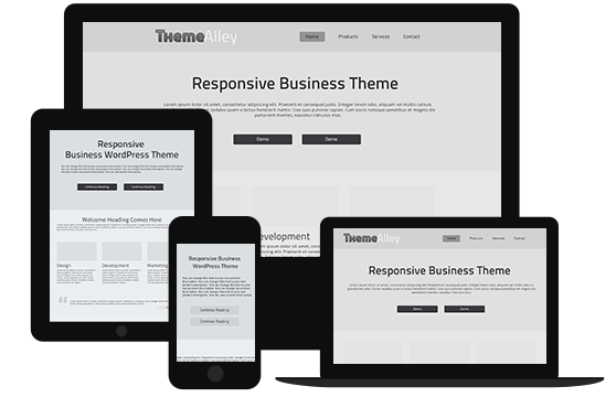
Because the interface is made up of smaller building blocks of rectangular shapes, adapting this interface to a smaller screen and different orientations (portrait and landscape) is simply a matter of resizing and placing these blocks differently, just like Lego pieces. This meshes well with the concept of responsive web design, in which a webpage adapts itself to the size and orientation of the screen it’s being displayed on to present the optimum experience for users.

It utilizes clean and functional design

Since it mostly relies on two main elements, rectangular shapes and typography, flat design won’t be confusing for users. The website for Wyss Institute, a bio-engineering research institute in America, employs a flat design for its main page, with news arranged in blocks akin to Windows 8.

To a lesser extent, the collection of information spread underneath, acting as introductory passages to what exactly the Wyss Institute stands for, employs a grid-based design as well. Each segment is placed within their own rectangular area. Flat design doesn’t always have to conform to the same uniform design language; brands can still build on the same principle of clean and functional design without looking similar to each other.

It is now an industry standard

While the unique applications vary from websites to websites, flat design works using the same underlining example. Using the same basic design saves users time by not having to adapt to another design language when they hop from one website to another. Think of it this way, if traffic lights around the world uses different colors instead of the same combination of red, yellow, and green, motorists would have problem when moving to another city.

Ask anyone who’s had to switch from right-hand drive vehicles to left-hand drive vehicles and I’m pretty sure cases of them opening the door on the passenger’s side instead of the driver’s side is pretty common.

Admittedly, flat design doesn’t give a lot of wiggle room for designers to be creative with their design, limiting customization to little more than colors and layouts. I prefer to consider this a good thing though. Brands should flex their creativity on contents while putting functionality considerations in their interface above all else. Flat web design achieves that goal while still enabling designers to achieve an aesthetically pleasing look, if done correctly.

How to Map Out Psychology-based SEO Strategies to Improve Your Business

How to Map Out Psychology-based SEO Strategies to Improve Your Business

Now that most business owners know how important SEO for business is, many of them start looking for the best SEO services in town. It may be exaggerating, but it’s true. When you own a business, SEO is the right solution for digital marketing part, since nowadays the technology keeps growing. However, it is not only about the technology. When it comes to human nature, psychology is the key. Why? That’s because human is your target audience. If you are a business owner, keep reading this article to find out the strategy to improve your business by mapping out psychology-based SEO strategies.

When SEO is seen in psychology and strategy perspective, the entire method has more punch when it reaches the stage of coding and content structuring. It can make use of synergies with marketing ventures like social media, press releases, public relations and more. As someone who has goals in business, your aims include:

  • Increase sales
  • Reduce costs (saved on other marketing channels)
  • Improve resource efficiency
  • Create synergies (that often last for years)

However, even after knowing the aims, there is a contrast between a low-priced SEO firm that relies purely on keyword-stuffing and basic link building which leaves a lot of money on the table from missed opportunities. Many Internet marketers know how important it is to begin with keyword research. Sadly, too many stop right there. Keywords are important. If done properly, they will help you comprehend exactly what your market wants, in specific numbers, and suggest methods of optimisation that are suitable. However, take a look at deeper intent and these keywords show a lot more about your prospective buyers that can help boost conversions. A keyword that’s a specific expensive food supplement suggests an affluent, health conscious prospect who searches for quality products, and is willing to pay for the best quality.

With that in mind, business owners need to look at every page as a ‘landing page’.  Also, they need to ask themselves these questions:

  • What are visitors arriving at this page looking for?
  • What problem are they facing and how can we help them?
  • How can we deliver an experience they’ve been looking for everywhere else?

If you implement SEO strategies based on using those questions, you can reach more people to look at your brand. If you need more information about SEO, feel free to contact us and we will gladly help you.