Flat as a Fiddle: 4 Benefits of Flat Web Design in 2018

Flat as a Fiddle- 4 Benefits of Flat Web Design

Just like the world of high fashion, web design has gone through several different trends during its relatively short existence. There was a time that simple flash animation was a pretty common sight on the internet. At the dawn of the 21st century, skeumorphism, a design language in which digital interface is made to closely mimic its real-life counterpart, a digital bookstore made to look like a bookshelf for example, briefly emerged as a leading trend before the world decided that a digital interface being limited to earthly restrictions kind of misses the point.

As a response to skeumorphism, the early 2010s ushered in a design trend that is still prevalent in today’s internet, referred to as flat design. Flat might be an adjective those in the music industry would like to avoid but it is actually one of the more functionally and aesthetically pleasing trend in web design. If you’ve ever used the oft-maligned Windows 8 OS, then you’re already familiar with how flat design looks like.

Flat design as a functional aesthetic

Flat design takes its name from the judicious use of two-dimensional characteristics, employing simple flat shapes as building blocks, contrasting color palette and noticeable typography to ensure a clean and minimalist interface. Flat design put its focus on the user’s experience. It aims to streamline user’s experience in order to provide optimum usability while still maintaining an aesthetically pleasing look.

Now, it’s true that the Windows 8 wasn’t favorably viewed by both the public and critics when it was first released but that’s more because it wasn’t a particularly good fit for mouse & keyboard users. Use it on a tablet or any touch-capable device and its brilliance shines through. Flat design came in part because of the world’s continuous shift into smartphones. With a much reduced screen real estate, web designers have to come up with a way to simplify navigation for users.

To do this, they look at the concept of minimalism and applied that similar line of thinking into the design of a user interface. As a result, flat design is stripped off of any frivolous features, displaying only the necessary elements for navigation to users. Using this approach results in a number of benefits for both the users and designers, functionally and aesthetically as well, which we’ll explore further in the article.

It’s highly flexible and modular

Because flat design relies on simple rectangular shapes and typography, it is highly modifiable by nature. It employs a grid-based design where things can be easily added or resized according to the whims of the designer, so long it doesn’t interfere with the user’s experience. The Windows 8 start menu and the pinned tiles in the Windows 10 is an example of this modular nature.

Content is still the focus on the modern internet and having an interface that allows you to mess with how that content is displayed without wrecking your website is a highly desirable characteristic for designers.

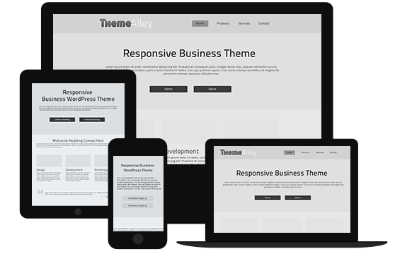
It fits perfectly with responsive design

Like what’s been stated above, Microsoft’s idea with Windows 8 is that it aims to present roughly the same experience to both smartphone users and traditional desktop users. As a result, Windows Phone 8, the mobile OS that was launched concurrently with the desktop OS, has the same interface as you’d find on desktop, only with slightly different layout and placement.

Because the interface is made up of smaller building blocks of rectangular shapes, adapting this interface to a smaller screen and different orientations (portrait and landscape) is simply a matter of resizing and placing these blocks differently, just like Lego pieces. This meshes well with the concept of responsive web design, in which a webpage adapts itself to the size and orientation of the screen it’s being displayed on to present the optimum experience for users.

It utilizes clean and functional design

Since it mostly relies on two main elements, rectangular shapes and typography, flat design won’t be confusing for users. The website for Wyss Institute, a bio-engineering research institute in America, employs a flat design for its main page, with news arranged in blocks akin to Windows 8.

To a lesser extent, the collection of information spread underneath, acting as introductory passages to what exactly the Wyss Institute stands for, employs a grid-based design as well. Each segment is placed within their own rectangular area. Flat design doesn’t always have to conform to the same uniform design language; brands can still build on the same principle of clean and functional design without looking similar to each other.

It is now an industry standard

While the unique applications vary from websites to websites, flat design works using the same underlining example. Using the same basic design saves users time by not having to adapt to another design language when they hop from one website to another. Think of it this way, if traffic lights around the world uses different colors instead of the same combination of red, yellow, and green, motorists would have problem when moving to another city.

Ask anyone who’s had to switch from right-hand drive vehicles to left-hand drive vehicles and I’m pretty sure cases of them opening the door on the passenger’s side instead of the driver’s side is pretty common.

Admittedly, flat design doesn’t give a lot of wiggle room for designers to be creative with their design, limiting customization to little more than colors and layouts. I prefer to consider this a good thing though. Brands should flex their creativity on contents while putting functionality considerations in their interface above all else. Flat web design achieves that goal while still enabling designers to achieve an aesthetically pleasing look, if done correctly.

Name It Right: How Your Brand’s Name is (Apparently) Important for Your SEO

SEO tips

Ever search for a restaurant you want to visit on Google, and then what appears next is a number of totally different places instead of the restaurant you are searching for? If that has ever happened to you, then the restaurant you were looking for has made a bad decision in choosing their restaurant’s name. Why? Believe it or not, a brand’s name plays a crucial role in SEO. If you are a business owner hiring SEO services to help your business grow, then you must consider naming your brand properly and uniquely. This article will tell you how important your brand’s name when it comes to SEO. Keep reading to find out!

How important is a brand’s name?

Well, most of you may already know Vin Diesel from his big role in Fast and Furious movies. Did you know that his name used to be Mark Sinclair? Surprised? Yeah, me too, when I first found out about it. But, have you ever wondered why he changed his name? Apparently, according to the information from people.com, he changed his name because Mark Sinclair wasn’t tough enough in Hollywood. The same goes with a brand’s name. A name can either make or break your brand, because the name of your brand will represent your brand’s authenticity, originality, characteristics, and uniqueness. As mentioned in the previous paragraph, if your brand’s name is still similar to other brands, or if your brand’s name is too general, then it will be difficult for people to find you. For example, you own a hair salon, and you recklessly name your salon “Beautiful Hair Salon.” Well, it might be a nice name, but when you search the name on Google, there will be plenty of salons using similar names and therefore making it difficult for you to rank high. Aside from that, “Beautiful Hair Salon” has ambiguous meanings that it can translate into “a hair salon that is beautiful” as well.

Then, how do we create a proper brand’s name?

First, think of a name that represents you but in a unique way. You can also use your own name for that. For example, if you own a cake shop and your name is Sharon, maybe you can use this name: ShareOn Cake by Sharon. However, be careful with the space. If you separate Share and On, it would be a general phrase with common and mixed ambiguous search results. Therefore, it is better for you to Google it first to make sure you are not creating any ambiguous or similar names with other things found on search engines. This will also let you know whether there are cake shops with the similar name or not.

The next step is to decide the targeted keywords that you will be focusing on for SEO purposes. When you type specific kinds of keywords on search engines, chances are, you will find millions of results. For example, if you type “delicious cakes” only, you will get millions of results. But that is not necessarily a good thing. Why? That is because you will get tougher competitions in terms of ranking. Therefore, it will be difficult for you to start up. On the other hand, if you type “delicious cakes in (your region and more specific region)”, though the results may reach to 800-100.000, it is less competitive and you will get more chances with the rank.

Last but not the least, shape your brand’s name with brand identity that will also explain the real origin of your brand’s name choice. This will strengthen your brand’s name and boost your brand awareness.

That’s how important a brand’s name for your business and how to make a proper brand’s name. I hope this gives you insights on what to do before starting out a new business. If you have any question about SEO or brand shaping, feel free to contact us and our professional team will be glad to help.

How Creativity Can Be A Problem to Your Website

creative design

Everyone wants to be creative in order to deliver the best works in their work. I used to think that being fully creative is the most important part in every design projects. While that may be partly true, it can be a problem sometimes, especially if you are dealing with web design. If you own a business, you know that in order for your business to be more recognised, you have to make your own website so that you can be more interactive with your customers or potential customers, and they can also feel familiar with your brand. A website also helps in building trust with your audience, because aside from always being informed and updated about what you’re up to, they can also trust that you are keeping it real and authentic. However, while having a website, you might want to be very creative in expressing yourself on your website, which can lead to a very beautifully designed website. That being said, will that website work well in the long run?

Well, as a person who wants to keep learning and learning more about design and creativity, I have come to a conclusion: it is not all about creativity. The more you design for people, the more you see that creativity is better if used for the people you design for, not for your own satisfaction. This means, you use your creativity to make the website easier to use and not only good in the eyes. Most of us start as visual designers, and then we grow and learn more about user interface, conversion, user experience, accessibility, or usability. That’s when you realise that it is not only about being creative.

While being creative is good for your website, using too much creativity without logically thinking will soon be a problem to your website. Why? Well, ever seen a website with cool introductions and creative animations before, but then when you stay on that website, you realise that the longer you stay there, the longer it takes to load and suddenly your PC starts to crash. Yes, that’s how creativity can be a problem to your website. The truth is that too-complicated layouts, too-creative solutions and reinventing wheels won’t make your users’ life easier. Therefore, a good balance between a creative, artistic, and original design while still making it intuitive, without losing usability yet still providing good results for the business is the right choice to be creative without having a problem. The question is; how? Well, this article will answer it for you! Keep reading to find out!

According to Google’s research, users prefer websites that look both simple (low complexity) and familiar (high prototypicality). While that doesn’t mean that your website should look boring, your website should be easy to access, especially in the navigation part where it can lead your visitors to every page easily as if they were being familiar with the website. Aside from that, your website should also look unique at the same time. One thing for sure, as unique as your website is, never ever make your visitors think hard just to access your website. There are many early established web conventions and standards like the placement of your logo, navigation, search bar or login link. There are even conventions on an icon’s meaning, website element names, (e.g. Home, Sitemap, or Contact), button styles, layout and visual hierarchy. All of these standards will help your users navigate and find what they need much faster and easier. Just stick to some of the most popular conventions but use your creativity elsewhere.

So, where should you put your creativity? You can use your imagination on visual design. You can always be creative when it comes to the visual design. That being said, that doesn’t mean you can put animation designs on every web pages. In the visual part of design, you can try to make over some colour with different colour schemes or interesting font combinations. You can also play with spacing, visual balance and hierarchy. Design original illustrations or clever hover and scrolling effects. Try to find creative ways to simplify your design. Minimalism is not about hiding features or content, but about doing less, which is better. Yes, actually simplifying design can very often need more creativity than making it complex.

That’s how you can balance between being creative while placing yourself in your visitors’ shoes – be them, and feel your own website. Put yourself in their perspective and that’s how you understand the unity between creativity and usability.