Just like the world of high fashion, web design has gone through several different trends during its relatively short existence. There was a time that simple flash animation was a pretty common sight on the internet. At the dawn of the 21st century, skeumorphism, a design language in which digital interface is made to closely mimic its real-life counterpart, a digital bookstore made to look like a bookshelf for example, briefly emerged as a leading trend before the world decided that a digital interface being limited to earthly restrictions kind of misses the point.
As a response to skeumorphism, the early 2010s ushered in a design trend that is still prevalent in today’s internet, referred to as flat design. Flat might be an adjective those in the music industry would like to avoid but it is actually one of the more functionally and aesthetically pleasing trend in web design. If you’ve ever used the oft-maligned Windows 8 OS, then you’re already familiar with how flat design looks like.
Flat design as a functional aesthetic
Flat design takes its name from the judicious use of two-dimensional characteristics, employing simple flat shapes as building blocks, contrasting color palette and noticeable typography to ensure a clean and minimalist interface. Flat design put its focus on the user’s experience. It aims to streamline user’s experience in order to provide optimum usability while still maintaining an aesthetically pleasing look.
Now, it’s true that the Windows 8 wasn’t favorably viewed by both the public and critics when it was first released but that’s more because it wasn’t a particularly good fit for mouse & keyboard users. Use it on a tablet or any touch-capable device and its brilliance shines through. Flat design came in part because of the world’s continuous shift into smartphones. With a much reduced screen real estate, web designers have to come up with a way to simplify navigation for users.
To do this, they look at the concept of minimalism and applied that similar line of thinking into the design of a user interface. As a result, flat design is stripped off of any frivolous features, displaying only the necessary elements for navigation to users. Using this approach results in a number of benefits for both the users and designers, functionally and aesthetically as well, which we’ll explore further in the article.
It’s highly flexible and modular
Because flat design relies on simple rectangular shapes and typography, it is highly modifiable by nature. It employs a grid-based design where things can be easily added or resized according to the whims of the designer, so long it doesn’t interfere with the user’s experience. The Windows 8 start menu and the pinned tiles in the Windows 10 is an example of this modular nature.
Content is still the focus on the modern internet and having an interface that allows you to mess with how that content is displayed without wrecking your website is a highly desirable characteristic for designers.
It fits perfectly with responsive design
Like what’s been stated above, Microsoft’s idea with Windows 8 is that it aims to present roughly the same experience to both smartphone users and traditional desktop users. As a result, Windows Phone 8, the mobile OS that was launched concurrently with the desktop OS, has the same interface as you’d find on desktop, only with slightly different layout and placement.
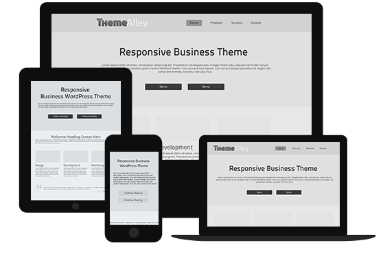
Because the interface is made up of smaller building blocks of rectangular shapes, adapting this interface to a smaller screen and different orientations (portrait and landscape) is simply a matter of resizing and placing these blocks differently, just like Lego pieces. This meshes well with the concept of responsive web design, in which a webpage adapts itself to the size and orientation of the screen it’s being displayed on to present the optimum experience for users.
It utilizes clean and functional design
Since it mostly relies on two main elements, rectangular shapes and typography, flat design won’t be confusing for users. The website for Wyss Institute, a bio-engineering research institute in America, employs a flat design for its main page, with news arranged in blocks akin to Windows 8.
To a lesser extent, the collection of information spread underneath, acting as introductory passages to what exactly the Wyss Institute stands for, employs a grid-based design as well. Each segment is placed within their own rectangular area. Flat design doesn’t always have to conform to the same uniform design language; brands can still build on the same principle of clean and functional design without looking similar to each other.
It is now an industry standard
While the unique applications vary from websites to websites, flat design works using the same underlining example. Using the same basic design saves users time by not having to adapt to another design language when they hop from one website to another. Think of it this way, if traffic lights around the world uses different colors instead of the same combination of red, yellow, and green, motorists would have problem when moving to another city.
Ask anyone who’s had to switch from right-hand drive vehicles to left-hand drive vehicles and I’m pretty sure cases of them opening the door on the passenger’s side instead of the driver’s side is pretty common.
Admittedly, flat design doesn’t give a lot of wiggle room for designers to be creative with their design, limiting customization to little more than colors and layouts. I prefer to consider this a good thing though. Brands should flex their creativity on contents while putting functionality considerations in their interface above all else. Flat web design achieves that goal while still enabling designers to achieve an aesthetically pleasing look, if done correctly.

