It is not uncommon anymore for business owners to have a website to attract more potential customers turned into real paying customers, in a world where almost everything is constantly changing. A website helps a business grow by providing complete information about a company and reliable services online that can also help in interacting with them in an easier way. Therefore, a business with a website is more credible than other businesses without a website. However, having a website alone doesn’t guarantee you 100% success, because it also depends on its web design. A website without its web design is like a burger without its beef. You could see the bread, but you couldn’t eat it and it simply is not considered as a proper burger at all and therefore you won’t eat it. Also, the proper design should not only give the visitors the entertainment for their eyes to see, but should also provide easier access for them.
Some web design trends are not giving the visitors what they need to see, and sometimes the design would only make it difficult for the visitors to navigate. In this article, we are going to share our thoughts on popular design trends since 2017 with you. Keep reading to find out!
Typography integrated into images
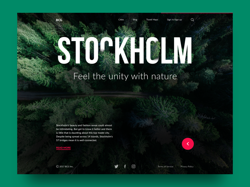
Bold and catchy typography has good influence both in web and mobile layouts. This time, it got a new touch with a widely spread technique of cutting or inscribing the title keyword or a headline into the visual elements on the page, like the example below.
However, we think it is a little bit risky putting typography between pictures on the headline if not properly done, because it would make the text unreadable. Therefore, make sure your web designer knows how to do it right.
Animated hero banners
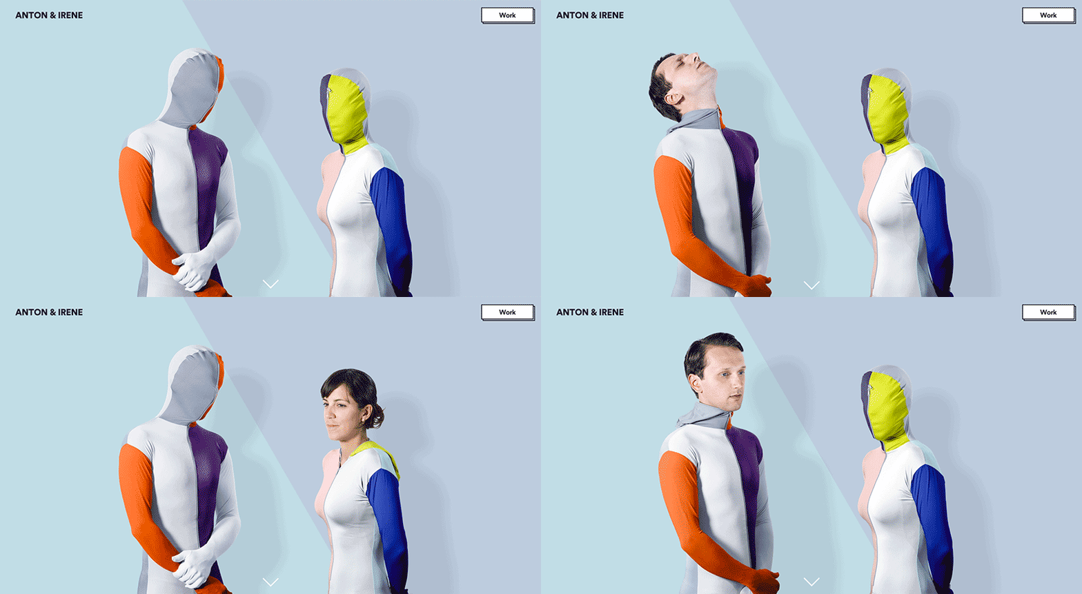
Hero banners are used for attracting users’ attention using visual interaction the moment users come to the website. The attractive visual presentation of the main content is the main contribution it gives for the website. With hero banners on the homepage of a website, it helps set the users’ mood so that they can comprehend the message the website is trying to convey more effectively. With the right content marketing strategy topped off with great interactive hero banners design, the website can be both informative and emotionally appealing at the same time.
That being said, having animation on the homepage can be risky and tough, since it could cause crash or lag during visiting the website. Also, slow loading page can make it difficult for visitors to access the website. Therefore, if you are considering this, you need to make sure your web designer knows how to deal with this.
Unframed layout
Imagine if your website had big background images or patterns without any frames. It would be spacious that would leave room for your imagination to play out. It enabled users to feel the layouts more airy and spacious while the background image deeper and stronger without breaking the interaction and without limits.
However, if not designed properly, it would come off as unruly and random; therefore, great design thinking is required for this design so that it can adjust to the size, the rows, and the images.
That’s all our review on the popular web design trends since 2017. Hopefully, this will give you some insights on your web design. That being said, in designing a website, it is better for you to consult to the web design professionals to get your website done more beautifully. If you need more insights on web design, feel free to contact us and our team will be ready to help you.


