Simple Methods of Adding SSL to Your WordPress Website

SSL WORDPRESS

People choose SSL mostly because it provides more secure information and gives more benefits, especially from a user’s perspective, as any information they share with your site via a form, shopping cart, etc. is encrypted – it is safe from the third party. However, few web developers that know the very same principles also apply to site administrators.

In fact, running the WordPress admin in https also brings huge benefit, since you can secure all the sensitive information you input daily inside of WordPress. All of this information needs protection; therefore, it is essential for every WordPress website out there to renew the certificate in every three months.

If you are in a tight budget, you can opt on the market for low-cost certificates that do the job nicely in most cases. Remember that ecommerce sites might be better off with higher level certificates that offer features like identity validation which allows customer to know you better.

This makes us have no reason for not giving a little time and money to understand and apply an SSL certificate. So, if you are committed to integrating SSL with a WordPress installation, now it’s time to discover the ways.

HTTPS Your WordPress

Before, we setup WordPress to utilize an HTTPS connection; you have to make sure that you already have an SSL certificate installed on your server. Actually, it is quite simple to setup WordPress to utilize an https connection, as follows:

  • Back up the site
  • Change the Site URL
  • Ensure all internal links and attachments use https
  • Run the WordPress admin in https
  • Automatically forward http requests to https

Change the Site URL

First, navigate over to settings > General inside the WordPress administration area since you’ll want to change the WordPress Address (URL) and Site Address (URL) from ‘http://www.yourdomain.com’ to ‘https://www.yourdomain.com’. Scroll down to the bottom and save the changes when you’re done and then, WordPress will automatically log you out. If you want to log back, you can use the newly-secured URL.

Make Sure All Internal Links/Attachments Use HTTPS

Even though you change the URL, image or attachment URL throughout WordPress, it will not suddenly switch your website into HTTPS. In order to discover ways to change the URL site, you can conduct a search and replace area of your database. One thing for sure, you need to back up your site to prevent anything from going wrong.

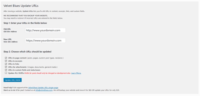
Nowadays, you can find many searches and replace plugins available for WordPress, but you can give a try to Velvet Blues Update URLs, as it can be an effective solution. Furthermore, this plugin only touches the areas of the database that need changes, so you will not mistakenly change the right thing. In fact, you can update URLs to get started once you’ve installed and activated the plugin, head over to tools > Update URLs to get started.

Don’t worry as using plugin is as simple as adding the old and new URLs for your site. All you need to do is make sure that all the settings look are correct then click “Update URLs Now” when you’re ready and let the plugin take care of the rest. You’ll see a report on the screen that says how many URLs are changed and where the plugin found them, once the URLs have been replaced.

Run the WordPress Admin in HTTPS

In order to ensure that there will be HTTPS in the WordPress back end, you should grab the latest version of your site’s wp-config.php file and add the following line just above “/* That’s all, stop editing! Happy blogging. */”:


Now, you can save and upload the file to your server.

Automatically Forward http Requests to Https

The last step is to make sure that you only use https URLs for your site. First, you need to download the latest copy of your site’s .htaccess file and add the following just underneath the line “RewriteEngine On”:

Then save and upload the file to your server. You can try and enter an http URL for your site in a browser to test it. If you do it right, it should automatically forward you to the https version. Bear in mind that every server has been set up differently, so you should find other ways to make this work. Feel free to contact your web host for suggestions.

Troubleshooting a ‘Broken’ Lock

Discover if there are any broken padlock icons in your browser’s address bar and/or mixed content warnings. If you find any, then something is trying to load in from an http address. Usually, it is caused by a script or other outside resource being called from your site’s theme or CSS. As a solution, you can refresh the page and see if that clears up the issue.

If the problem is still going on, you can visit “Why No Padlock?” and input your URL that you want to analyze. The site will scan and analyze it for you.

Conclusion

Keeping user’s information private is an important thing, especially if you are doing a business in digital world. By seeing the green padlock in your site’s address, users will think that your business takes their personal information seriously. This will surely increase their trust and interest to buy something from you or even fill out a simple contact form.
Simple Tips for Designing a Browserless Web

browserless_ywf

Browserless web is best known as communication over the World Wide Web between programs rather than between people and the server programs at Web sites. Many people believe that in the future, program-to-program communication will be more popular, as it will generate more traffic than browser-to-Web site communication. Even though browser-to-Web site communication is program-to-program – the browser is a client program and the Web server is a server program on behalf of a Web site – this new program-to-program communication does not involve an interactive user. Application that orders fulfillment is likely candidates for the browser less Web.

Of course, there are also some pros and contras on the topic of native versus web experiences. Many are comparing its reliability and speed with the native app experience. Therefore, in this article, we will explain how to design and develop progressive web applications (PWAs) in brief, so that many can experience a browserless web. Hopefully, this article would be beneficial for web developers or web designers who want to create a more engaging web.

  • Instant Page Transitions

It’s an open secret that users do not want to wait. Therefore, you have to be able to get in and around an app quickly without making them wait for your content to load in each interaction.

Solved with PWA

In order to pass the Lighthouse checklist for a PWA, one must follow certain performance-enhancing guidelines. Then, the content will be cached behind the scenes and to make you feel like there is no loading event, content should be cached behind the scenes.

  • Perceived Performance

You might be surprised by knowing that the level of stress caused by mobile delays is pretty much the same as watching a horror movie. Therefore, a good app should not let their users wait for their content. Other thing like elements appearing asynchronously as the app loads should also be avoided.

Solved with PWA

With the “Add to Homescreen” PWA launch transition, you can have a visual bridge between loading and loaded content. This shows how “preloaded states” can increase the perception of speed and seamlessness. Through a well-designed PWA, you can mimic the end state of the page and by using lazy-loading to deprioritize elements that are out of view; you can make the initial loading seem faster.

  • Works Offline

People, who prefer to download native apps, mostly want to use the apps without constantly relying on an Internet connection in order for the apps to function properly.

Solved with PWA

To solve this problem, the page content will be cached behind the scenes, allowing it to be accessed where there would, otherwise be a lag  in the browsing experience, such as when entering a tunnel while driving.

  • Back Button

Android provides a back button through the device which makes some people think there is no need to replace the browser’s back functionality. In fact, most apps choose to offer a back button in the header as an “up” action that navigates within the hierarchical relationship between pages.

Solution

The only possible solution for this problem is to place the menu button in the top left with a back button once the user progresses past the initial page. It will be validated once we put this pattern in front of users. Once participants had progressed through the initial home page, you can ask them to navigate to a new section.

 Can We Use it in the Real World?

Of course you will need “Add to Homescreen” to develop into an accepted group of patterns. To get some best practices about browserless web, you can read the following practices:

Sticky Headers, Persistent Actions

With this sticker, visitors can understand about the importance of learning ability when introducing new patterns.  In fact, the main purpose of this sticker is to ensure that users can easily find crucial global actions.

Prompt Intelligently

As it is said that PWA’s will get full control when they want to prompt users, this makes “Add to Homescreen” installation increase.

Stress and Test

One of the most important validation processes is to do the stress test in multiple applications. This is because, in most cases, the pattern stood up well to the latest brand. For example, the Lancome’s PWA contains many calls to action, which, as a result, can help in identifying overflow menu as a great opportunity to simplify its user interface, while offering exclusives program.

Conclusion

Many believe that “Add to Homescreen” will offer users to a next level experience, which is more engaging and converting user. This is because, a more modern, app-like web can have more positive effects on engagements, as it meets user expectations of performance and design.

The only way to meet those expectations is by combining PWA performance enhancements with intuitive design patterns in navigation and app-like user experience.

5 Recommended Tips to Optimize Your Product Pages for More Sales

How to Optimize Your Product Pages for More Sales_YWF

When you have many visitors, yet you still haven’t seen any significant sales from your page, you might ask yourself;” what’s wrong?”, but don’t worry, here we have some recommended tips that can be beneficial for you to optimize your product pages for more sales. If you are business owners, SEO services agents, web developers, or web designers, this is a must-read article. So, let’s discover what they are.

  1. Knowing What Makes a Great Product Page

In general, product page is made to serve visitors with the right amount of information. It will help them understand the product whilst convince them that buying this product will work out for them.

As stated by Rosara Joseph, Content Strategist at VentureWeb,“The paramount goal for your product pages should build user confidence by providing all the information necessary for a purchasing decision and making the process as intuitive and as straightforward as possible.”

  • Even though it sounds simple, actually there are four things that everyone should keep in mind if they want to create a truly great product page:Your Product
  • Of course product is the main actor. That is why, it is important to know how it should be presented and what questions that come to your customers’ mind before they commit to buy your product.Your Brand
  • Branding is also another thing that is important, especially when selling products online. Without having a good branding on your homepage, it is almost impossible for someone to discover your site if they have never bought a product from you before.Your Copywriting
  • Another element that also plays an important role is your copywriting skill; because it’s how you combine the written information your customers need, then serve it with your brand’s unique voice and tone.Your Page Design and Your User Experience

Believe it or not, but how things are arranged on the page, and what’s included can really have a big impact on your conversions. Therefore, make sure you place things right on your website; this will help visitors feel convenient when buying your product.

By knowing these four elements, you can focus on things that really matter to the success of your sales.

  1. Having a Clear Call-to-Action (CTA)

It is clear that the goal on a product page is to make visitors have a deal with what you offer without doubt. According to Maria Bonello, Director of Strategy at SMAKK studios, in order to have a successful CTA button, one should make sure that the area around the button should be uncluttered, so that there are no distractions or obstacles that can block the user. Therefore, make sure that there is nothing that can draw visitors’ attention away from the CTA button. You can also have a bit of extra advice on the copywriting side, but don’t try to be clever with the CTAs, instead, you can use simple phrases such as “add to cart” or “submit order”.

  1. Adding Social Proof

Nothing works best than having social proof on your website, as it can help you build credibility and definitively boost conversion. Some of social proofs that work well are reviews, photos from Instagram, and first-person testimonials.

  1. Having a Good Understanding about Your Customers

In order to make people buy from you, you need to really understand who your customers are and what they want from you. The best way is to learn who they are, what their motivations, and what matters to them by digging into their customer profile.

  1. Presenting Great Product Photography

Product photography plays such a major role on product pages as photos are the only thing that visitors can actually see before they decide to buy things. So, why don’t you invest on photos? In fact, as it is said by Maria Bonello of SMAKK studios, “ it’s your opportunity to design an experience that casts your product in the best light, so do the best to get what you want, such as show multiple angles, allow users to zoom, call out unique features, and many more”.

After all making a great product cannot happen in one night, it requires lots of efforts and creativity. If you want to leverage your sales, you can take the tips above and see how it can take your sales to the next level.