Knowing Why Tabbed Content Might be Hurting Your Search Rankings

Every writer loves to see its website’s body content look clean and concise. Therefore, as a solution, they usually put content behind tabs, but is tabbed content a good thing for your search engine optimization? Every effort that you make should be relevant to Google, especially if you are writing for SEO service. Hence, in this article we are going to discuss about how tabbed content will hurt your search rankings and what you should do to fix it. Find the answers below.

Why Tabbed Content Can Hurt Your Rankings

It is no secret that search engine crawlers have a difficulty in reading JavaScript over the years. Even though Google has made so many attempts to understand how JavaScript has become essential in modern day website design, still, there are so many things that should be fixed. This is because JavaScript is a complicated yet beautiful thing.

However, since we don’t know what part of JavaScript that Google can and can’t read, the best solution we can offer is to make sure that your JS are readable and not disallowed in your robots.txt. When Google doesn’t understand, any piece of content within that sector won’t be displayed or rendered. This means your well-structured content will offer no value to your search aspirations.

To know whether Google can understand your content or not, you can use the Fetch as Google function within Google Search Console, which displays both a rendered version for Googlebot and how a visitor will see the page.

So, what’s wrong with tabbed content? Well, tabbed content is typically created using JavaScript using div.tabs. While search engine can typically read this, Google, on the other hand, doesn’t have the ability like a human has to click on a different tab. The main reason is because the action that displays the tabbed content isn’t a standard hyperlink that crawlers are designed to follow.

In the example below, you can see how a standard piece of tabbed content contains a standard hyperlink:

<button class=”tablinks” onclick=”OPENTAB(event, ‘EVENTNAME’)” id=”defaultOpen”>TAB TITLE</button>

<script>

document.getElementById(“defaultOpen”).click();

</script>

Therefore, Google can only read your first tab, since this is static on your page, while other tabs might be ignored. Can you imagine how many words you are losing out? For example, you have five tabs, all with 200 words in each, so you are losing out on 800 words on your page. In other words, this brings bad news to your webpage because it will surely lower your content quality for missing out on those keyword-rich and relevant pieces of content.

What Can We Do?

Nothing can make Googlebot effectively crawl your website, unless you completely remove tabbed content altogether. This is because tabbed content is dependent on the kind of code showcased above. By implementing this method, you can index every single piece of content you have created.

In fact, a research has been conducted to prove this theory. The results show that pages which weren’t gaining any positioning could possibly go from Page 3 to Page 1 only by removing the tabbed content. In fact, once the Googlebot notice that the rich content is not being hidden anymore, it will directly go to page 1 status.

Arguments against This Ideology

It is better to have many arguments rather than one, right? So, it will be good to consider other factors. Below is a short list of other possible factors that may have affected these search engine results:

  • Page age: When webpages have been developed for some times, it will get older, trust grows and will affect the position. However, the pages showcased in this research contain no information that indicates the date that the page is created.
  • Natural organic external links: In the time the research being monitored, no external links are built to these pages.
  • Algorithm changes: the ongoing content quality updates help. This means that ongoing algorithm changes would benefit pages that showcase more and relevant content.
  • Page creation: Prior to the page being developed, pages may not gain any position for 3 months.
  • Existing on-page optimization: Standard SEO is applied after the pages are created, such as meta optimization, content creation, header optimization and image optimization.

The Future Outlook

Now, the biggest question is, will Google ever be able to read tabbed content? There is no absolute answer for this question. In fact, any kind of answer is purely speculative. For now, through so many researches, we can conclude that Google isn’t ready to handle JavaScript, so it is better to keep a keen eye out for any JavaScript, for it may harm your websites rank.

Tutorial on How to Create the Ultimate UX Design of the Credit Card Payment

Today, credit card is the most efficient method that many people can use. Therefore, it is important for any web developers and web designers to develop and design a payment page that will make users feel comfortable to interact with. However, first, you need to know how good payment page can successfully reduce the risk of losing money.

How Good Payment Page Design Can Help You?

It will be terribly sad to lose a customer at the very last step, right? Therefore, you need to make sure that your last step will contribute you money by designing payment page that contains qualities, such as below:

Help People Succeed

When your customers have reached till this point, the good news is that they really want to pay, so, it will depend on your design whether they can help users succeed in their purchase or not. A good page design is one of the important elements that will determine their decision, whether you help your users succeed in their purchase or rather make it really hard for them.

Do the Job for them

Not only can you reduce the number of form fields, but you can also extend your help by doing part of the job for your customers. Apple in their Credit Card Payment Form detects the type of credit card you’re using and makes it a little bit easier as you don’t need to choose your type from a traditional list. The responsiveness of the form is also important as it helps people focus.

Even though it is rather simple, Credit card Numbers are created in a significant ways.  American Express cards start with either 34 or 37. Mastercard numbers begin with 51–55. Visa cards start with 4. This card can also be used to detect what type of credit card someone is using.

Make Them Feel Safe

Knowing that your customers feel safe is important, as your credit card payment form will be a disaster if you fail to provide a safe-looking environment. Therefore, we tell customers that we’ve invested in the 128-bit SSL encrypted protocol to secure their sensitive data. This is aimed to ensure that we put safety first.

Step-by-Step Tutorial

Now that you know  the reasons, you may get encouraged to create good payment page, right? If you are interested in creating one, you follow the steps below:

  1. Basic Structure

Basic structure of the interface in mind is the best form to start from. Bare boxes represent general content pieces and space that will be filled with UI elements. This will make you stay focused.

  1. Headline and Call-to-Action

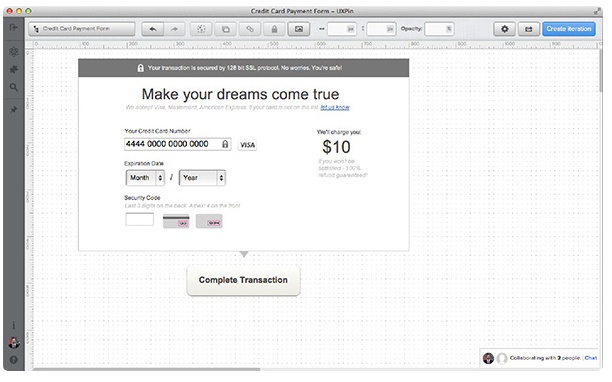
The next step is to form two important elements; a headline and a call-to-action. In the headline, we’re  looking for something emotional, but not too catchy. Since we want our users to go forward smoothly, we can design a headline that is quite emotional but not too catchy.

Remember to give a statement that can support your customers in the sub-headline. For example, you can write, “we accept Visa, Mastercard, and American Express. If your card is not on the list, let us know.”

On the other hand, a call-to-action should be precise. Avoid using general things like “Continue”, “OK”, ”Done”-These kinds of words give nothing to the context for the whole process and may confuse your customers. Besides, these words have a lack of sense of urgency. Therefore, it is just seen as a call-to-action.

  1. Safety Indicators

I

In the paragraphs above, we were discussing the importance of safety and price in the credit card form. Let’s try!

Moreover, it is important to make sure that the payment process will go smoothly, take a look at some tips below:

  • At the top, we describe about the technical safety provided by the SSL protocol. That’s causing a positive frame around the whole form.
  • Second, we not only inform them about the price, but also we tell them that a refund is possible.
  1. Form Fields

In this part, we design important form fields. This kind of form will let you proceed with the payment without knowing our customer’s name due to a backend transactional mechanism, but you may need the CVV code.

Moreover, to indicate that all data is safe, we’ve decided to place an additional “lock” icon in the form field. Most credit cards in the world will put “/” between two selects of the Expiration Date, we’re I’m addressing the mental model created by credit cards.

  1. Labels and Prompts

At the last stage, we place labels and all the important prompts. We’ve applied the mechanism of the auto-detection of a credit card number. However, since we want my form to respond faster to user input, we designed a place for a credit card icon at the right of the Credit Card Number field.

Since the Security Code is always a tricky field, we’ve secured it with a textual prompt “Last 3 digits on the back. Amex: 4 on the front”, as well as icons showing where to find the code.

In conclusion, all of the attempts above are made to help you close the sales and gain money from your selling; therefore, you need to work together with your developers and designers to produce a payment page that support customers and make them feel comfortable with the ultimate UX design tips above.