Json-api-normalizer: Why JSON API and Redux Work Best When Used Together

As a web developer, we have to manage the data needed for every application we work on. There are problems when doing so, such as:

  1. Fetch data from the back end.
  2. Store it somewhere locally in the front-end application.
  3. Retrieve the data from the local store and format it as needed by the specific view or screen.

In this article, we are going to discuss about the data usage from JSON, the JSON API and GraphQL back ends, and from that, we can learn the practical way on how to manage front-end application data. As for the real use, let’s imagine that we have carried out a survey that asks the same questions of many users. After each user has given their answers, other users can comment on them if wanted to. Our web app will perform a request to the back end, store the gathered data in the local store and render the content on the page. In order to make it stay simple, we will leave out the answer-creation flow.

Redux Best Practices

What makes Redux the best is that it is changeable no matter what kind of API you consume. It doesn’t matter whether you change your API from JSON to JSON API or even GraphQL and back during development, as long as you keep your data model, so it will not affect the implementation of your state management. Below is the explanation on the best practice using Redux:

  1. Keep Data Flat in the Redux Store

First, here’s the data model:


Based on the picture above, we have a question data object that might have many post objects. It is possible that each post might have many comment objects. Each post and comment has respectively one author.

Let’s say we have a back end that returns a specific JSON response. It is possible that it would have a carefully nested structure. If you store your data in the same way you do in the store, you will face many problems after that, like, for instance, you might store the same object many times like this:

{

  “text”: “My Post”,

  “author”: {

    “name”: “Yury”,

    “avatar”: “avatar1.png”

  },

  “comments”: [

    {

      “text”: “Awesome Comment”,

      “author”: {

            “name”: “Yury”,

        “avatar”: “avatar1.png”

      }

    }

  ]

}

In the example above, it indicates that we store the same Author object in several places, which is bad, because not only does it need more memory but it also has negative side effects. You would have to pass the whole state and update all instances of the same object especially if somebody changed the user’s avatar in the back end.

To prevent something like that from happening, we can store the data in a flattened structure. This way, each object would be stored only once and would be easily accessible.

{

  “post”: [{

    “id”: 1,

    “text”: “My Post”,

    “author”: { “id”: 1 },

    “comments”: [ { “id”: 1 } ]

  }],

  “comment”: [{

    “id”: 1,

    “text”: “Awesome Comment”

  }],

  “author”: [{

    “name”: “Yury”,

    “avatar”: “avatar1.png”,

    “id”: 1

  }]

 }

  1. Store Collections as Maps Whenever Possible

After we have the data in a good flat structure, we can gradually accumulate the received data, in order for us to reuse it as a cache, to improve performance or for offline use. However, if we combine new data in the existing storage, we have to select only relevant data objects for the specific view. We can store the structure of each JSON document separately to find out which data objects were provided in a specific request to gain this. There is a list of data object IDs that we can use to gather the data from the storage.

Let’s say there is a list of friends of two different users, Alice and Bob. We will then perform two requests to gather the list and review the contents of our storage consequently. Let’s suppose that from the start the storage is empty.

/ALICE/FRIENDS RESPONSE

Here’s the User data object with an ID of 1 and a name, Mike, like this:

{

  “data”: [{

    “type”: “User”,

    “id”: “1”,

    “attributes”: {

      “name”: “Mike”

    }

  }]

}

/BOB/FRIENDS RESPONSE

This is another request that would return a User with the ID of 2 and Kevin as the name:

{

  “data”: [{

    “type”: “User”,

    “id”: “2”,

    “attributes”: {

      “name”: “Kevin”

    }

  }]

}

STORAGE STATE

This is what our storage state would look like:

{

  “users”: [

    {

      “id”: “1”,

      “name”: “Mike”

    },

    {

        “id”: “2”,

        “name”: “Kevin”

    }

  ]

}

STORAGE STATE WITH META DATA

In order to find out or distinguish which data objects in storage are relevant, we have to keep the structure of the JSON API document. With that focus, we can change it into this:

{

  “users”: [

    {

      “id”: “1”,

      “name”: “Mike”

    },

    {

        “id”: “2”,

        “name”: “Kevin”

    }

  ],

  “meta”: {

      “/alice/friends”: [

        {

          “type”: “User”,

          “id”: “1”

        }

      ],

      “/bob/friends”: [

        {

          “type”: “User”,

          “id”: “2”

        }

      ]

  }

}

With this, we can now read the meta data and gather all mentioned data objects. Now here’s the recap of the operations’ complexities:

As can be seen from the picture above, maps certainly works better than arrays because all operations have O(1) as the complexity instead of O(n). If we use a map instead of an array for the User data object, it would be like this:

STORAGE STATE REVISED

{

  “users”: {

      “1”: {

        “name”: “Mike”

      },

      “2”: {

        “name”: “Kevin”

      }

  },

  “meta”: {

      “/alice/friends”: [

        {

          “type”: “User”,

          “id”: “1”

        }

      ],

      “/bob/friends”: [

        {

          “type”: “User”,

           “id”: “2”

        }

      ]

  }

}

Now with this simple method, we can find a specific user by ID almost instantly.

Processing the Data and JSON API

There are many solutions to convert JSON documents to a Redux-friendly form. However, while there is no significant change within the application’s lifecycle, it will cause a failure if things are too dynamic, even though normalizing the function with the provision of a JSON document works great if your data model is known in advance.

Using GraphQL might be possible and interesting as well; however, if our APIs are being consumed by many third parties, we can’t adopt it.

JSON API and Redux

Redux and the JSON API work best together. The data provided by the JSON API in a flat structure by definition conforms nicely with Redux best practices. The data is typified in order to be naturally saved in Redux’s storage in a map with the format type → map of objects.

There are things to consider, though. First, it should be noted that storing the types of data objects “data” and “included” as two separate entitles in the Redux store can violate Redux best practices, as the same data objects would be stored more than once.

To solve these problems, we can use the main features of json-api-normalizer, such as:

  • Merge data and included fields, normalizing the data.
  • Collections are converted into maps in a form of a id=> object.
  • The response’s original structure is stored in a special meta

First, in order to solve problems with redundant structures and circular dependencies, the introduction of the distinction of data and included data objects in the JSON API specification is needed. Second, there is a constant update on data in Redux, although gradually, that can help with the performance improvement.

 Now that you know why JSON API works best with Redux, it can be concluded that this approach can assist us in prototyping a lot faster and flexible with changes to the data model. If you are in doubt whether using Redux with JSON API or not, this article will help you find the solution and reason why you shouldn’t doubt this method.
Tutorial on How to Create the Ultimate UX Design of the Credit Card Payment

Today, credit card is the most efficient method that many people can use. Therefore, it is important for any web developers and web designers to develop and design a payment page that will make users feel comfortable to interact with. However, first, you need to know how good payment page can successfully reduce the risk of losing money.

How Good Payment Page Design Can Help You?

It will be terribly sad to lose a customer at the very last step, right? Therefore, you need to make sure that your last step will contribute you money by designing payment page that contains qualities, such as below:

Help People Succeed

When your customers have reached till this point, the good news is that they really want to pay, so, it will depend on your design whether they can help users succeed in their purchase or not. A good page design is one of the important elements that will determine their decision, whether you help your users succeed in their purchase or rather make it really hard for them.

Do the Job for them

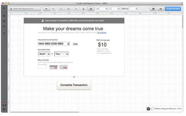
Not only can you reduce the number of form fields, but you can also extend your help by doing part of the job for your customers. Apple in their Credit Card Payment Form detects the type of credit card you’re using and makes it a little bit easier as you don’t need to choose your type from a traditional list. The responsiveness of the form is also important as it helps people focus.

Even though it is rather simple, Credit card Numbers are created in a significant ways.  American Express cards start with either 34 or 37. Mastercard numbers begin with 51–55. Visa cards start with 4. This card can also be used to detect what type of credit card someone is using.

Make Them Feel Safe

Knowing that your customers feel safe is important, as your credit card payment form will be a disaster if you fail to provide a safe-looking environment. Therefore, we tell customers that we’ve invested in the 128-bit SSL encrypted protocol to secure their sensitive data. This is aimed to ensure that we put safety first.

Step-by-Step Tutorial

Now that you know  the reasons, you may get encouraged to create good payment page, right? If you are interested in creating one, you follow the steps below:

  1. Basic Structure

Basic structure of the interface in mind is the best form to start from. Bare boxes represent general content pieces and space that will be filled with UI elements. This will make you stay focused.

  1. Headline and Call-to-Action

The next step is to form two important elements; a headline and a call-to-action. In the headline, we’re  looking for something emotional, but not too catchy. Since we want our users to go forward smoothly, we can design a headline that is quite emotional but not too catchy.

Remember to give a statement that can support your customers in the sub-headline. For example, you can write, “we accept Visa, Mastercard, and American Express. If your card is not on the list, let us know.”

On the other hand, a call-to-action should be precise. Avoid using general things like “Continue”, “OK”, ”Done”-These kinds of words give nothing to the context for the whole process and may confuse your customers. Besides, these words have a lack of sense of urgency. Therefore, it is just seen as a call-to-action.

  1. Safety Indicators

I

In the paragraphs above, we were discussing the importance of safety and price in the credit card form. Let’s try!

Moreover, it is important to make sure that the payment process will go smoothly, take a look at some tips below:

  • At the top, we describe about the technical safety provided by the SSL protocol. That’s causing a positive frame around the whole form.
  • Second, we not only inform them about the price, but also we tell them that a refund is possible.
  1. Form Fields

In this part, we design important form fields. This kind of form will let you proceed with the payment without knowing our customer’s name due to a backend transactional mechanism, but you may need the CVV code.

Moreover, to indicate that all data is safe, we’ve decided to place an additional “lock” icon in the form field. Most credit cards in the world will put “/” between two selects of the Expiration Date, we’re I’m addressing the mental model created by credit cards.

  1. Labels and Prompts

At the last stage, we place labels and all the important prompts. We’ve applied the mechanism of the auto-detection of a credit card number. However, since we want my form to respond faster to user input, we designed a place for a credit card icon at the right of the Credit Card Number field.

Since the Security Code is always a tricky field, we’ve secured it with a textual prompt “Last 3 digits on the back. Amex: 4 on the front”, as well as icons showing where to find the code.

In conclusion, all of the attempts above are made to help you close the sales and gain money from your selling; therefore, you need to work together with your developers and designers to produce a payment page that support customers and make them feel comfortable with the ultimate UX design tips above.

4 Ways of Boosting UI Design with Vibrant Colours

Ways of Boosting UI Design with Vibrant Colours

Colour has strong effects and impressions for almost everything. When you come into someone’s house, the first thing you would notice is the colour of their house and how it gives you different kinds of vibes depending on what combination of colours it has. That’s why; colour has the most powerful influence for all designs. Not only can it trigger different kinds of reactions, emotions, or moods, it can also boost the audience’s impressions upon seeing it.

The same thing applies to UI design too. For a web designer, colour in UI design is very important because it can draw attention and influence the reaction of the people who see it. Nowadays, designers use vibrant colours for their design. Vibrant is generally used to describe bright and intense colour, although vibrant isn’t a precise colour term, since people will use it differently. Bright colours with cartoonish designs are usually good for entertainment designs and elegantly minimalist colour and styles are well-suited for business designs. Therefore, vibrant colour is one of the biggest UI design trends of 2017.

What makes it unique is that vibrant colour can be applied in different ways and styles to design. In this article, we are going to explore the ways of boosting UI design using vibrant colours!

1. Monotone
Monotone is one of the most popular ways to use vibrant colours for a design. It is easy to create and makes text very readable. Monotone palettes come with a single colour with a mixture of shades and tints. Choose the colour that matches with your message. If paired with perfect typography, monotone colour schemes will create a really amazing look,.

2. Duotone
Duotone is an image created from two colours. It can be either two shades of the same colour, or two different colours. Duotone enables you to express an image with the emotional elements from the combination of any colour. Different colours can stir different kinds of emotions, depending of which colours and its combination you use. For example, the combination of soft and simple colour can represent business-like atmosphere, while the combination of bright colours can express happiness with a positive mood. It also adjusts the colour variations in an image. That way, the text can be placed anywhere on the image and is still perfectly readable.

3. Gradients
Gradients in the combination of the same colour that illuminates from light to dark can give the impression of modernism. It can also improve visual communication, whether it is a full gradient background or smaller places for the gradients. What makes smaller areas of gradient easier and more interesting is that you have more options to be creative with this technique, and when applied in smaller spaces, it can be visually attractive to play with multiple colour pairs.

4. Overlays
Overlaying is the application of semi-transparent coloured box covering an image or a video. It has been a popular design choice for a long time because it is easy to create. However, you have to be careful in setting the degree of saturation and transparency of the colour, because you have to make sure whether the text is still easily readable or not.

Now you know the ways of boosting your UI design using vibrant colours! Whatever you choose between these 4 types, make sure you put the text with the right colour combination so that the text is easy to read and the design is interesting to look at.