How to Create a Design that Satisfies

Two-Types-of-User-Motivation--Design-to-Satisfy-ywf

Believe it or not, working as a designer or web designer will require you to know your users and motivate them. You might think that designers sound like phycology, but this is actually important for designers to acknowledge a little knowledge of phycology, especially about motivation and how to apply a good motivation in their design, since by utilizing good motivation on your design, you will provide strong reasons for users to take an action for buying your product. Take a look further on how motivation can really affect your design, such as follows.

What is Motivation?

Motivation is famously known as something that can encourage people. It gives motives, needs or wants that drive behavior and explain why people do something. In design, motivation is also needed; it could help designers see the direct way to make the product correspondent to users’ expectations and solve user’s problems. However, before your product can help users, first you have to create a product that can motivate users to try it.

There are two types of motivation that we know, extrinsic motivation and intrinsic motivation:

Extrinsic motivation

These motives come from outer sources, such as family, professional environment, competitions, contests, etc. In most cases, people who have extrinsic motivation are usually seeking of reward, such as money, prizes, diplomas, certificates, trophies, medals, praise, support, recognition, or the desire to compete with others. As a designer, we can discover users’ extrinsic motives through research for UX designers. Once we know their extrinsic motivation, we can create a design that can stimulate them.

Intrinsic motivation

Oppositely, intrinsic motivations come from inner sources, such as the need of self-improvement. This type of motivation is stronger than extrinsic motivation. If you can nail this motivation from a user, it will become a significant factor for retaining users. Therefore, it is important to get to know more about target audience at the stage of user research; in this way, designers can discover what their motives are and what kind of designs that will work for the specific users.

Knowing the types of motivation will surely help designers in creating a design that will attract and serve users best. In fact, this knowledge is necessary for UI/UX designers for several reasons, such as follows:

  • Building navigation and call-to-action elements that can truly engage to users and motivate them to take action.
  • Designing better layouts that can demonstrate key benefits or rewards.
  • Creating a process that can motivate users to try the product and test its functions.
  • Presenting aesthetic satisfaction so that users feel comfortable with your product.
  • Providing the copy that can stimulate users through describing the benefits and achievements of your product.
  • Encourage users to share their experience via various social networks; this can be a powerful extrinsic motive for other people nowadays.

Now that you know motivation is terribly important in design, by understanding users’ motivation, you can build the right design that can reach many users. So, don’t forget to analyze your users’ motivation before designing for them.
 

Tutorial on How to Create the Ultimate UX Design of the Credit Card Payment

Today, credit card is the most efficient method that many people can use. Therefore, it is important for any web developers and web designers to develop and design a payment page that will make users feel comfortable to interact with. However, first, you need to know how good payment page can successfully reduce the risk of losing money.

How Good Payment Page Design Can Help You?

It will be terribly sad to lose a customer at the very last step, right? Therefore, you need to make sure that your last step will contribute you money by designing payment page that contains qualities, such as below:

Help People Succeed

When your customers have reached till this point, the good news is that they really want to pay, so, it will depend on your design whether they can help users succeed in their purchase or not. A good page design is one of the important elements that will determine their decision, whether you help your users succeed in their purchase or rather make it really hard for them.

Do the Job for them

Not only can you reduce the number of form fields, but you can also extend your help by doing part of the job for your customers. Apple in their Credit Card Payment Form detects the type of credit card you’re using and makes it a little bit easier as you don’t need to choose your type from a traditional list. The responsiveness of the form is also important as it helps people focus.

Even though it is rather simple, Credit card Numbers are created in a significant ways.  American Express cards start with either 34 or 37. Mastercard numbers begin with 51–55. Visa cards start with 4. This card can also be used to detect what type of credit card someone is using.

Make Them Feel Safe

Knowing that your customers feel safe is important, as your credit card payment form will be a disaster if you fail to provide a safe-looking environment. Therefore, we tell customers that we’ve invested in the 128-bit SSL encrypted protocol to secure their sensitive data. This is aimed to ensure that we put safety first.

Step-by-Step Tutorial

Now that you know  the reasons, you may get encouraged to create good payment page, right? If you are interested in creating one, you follow the steps below:

  1. Basic Structure

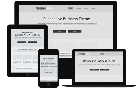
Basic structure of the interface in mind is the best form to start from. Bare boxes represent general content pieces and space that will be filled with UI elements. This will make you stay focused.

  1. Headline and Call-to-Action

The next step is to form two important elements; a headline and a call-to-action. In the headline, we’re  looking for something emotional, but not too catchy. Since we want our users to go forward smoothly, we can design a headline that is quite emotional but not too catchy.

Remember to give a statement that can support your customers in the sub-headline. For example, you can write, “we accept Visa, Mastercard, and American Express. If your card is not on the list, let us know.”

On the other hand, a call-to-action should be precise. Avoid using general things like “Continue”, “OK”, ”Done”-These kinds of words give nothing to the context for the whole process and may confuse your customers. Besides, these words have a lack of sense of urgency. Therefore, it is just seen as a call-to-action.

  1. Safety Indicators

I

In the paragraphs above, we were discussing the importance of safety and price in the credit card form. Let’s try!

Moreover, it is important to make sure that the payment process will go smoothly, take a look at some tips below:

  • At the top, we describe about the technical safety provided by the SSL protocol. That’s causing a positive frame around the whole form.
  • Second, we not only inform them about the price, but also we tell them that a refund is possible.
  1. Form Fields

In this part, we design important form fields. This kind of form will let you proceed with the payment without knowing our customer’s name due to a backend transactional mechanism, but you may need the CVV code.

Moreover, to indicate that all data is safe, we’ve decided to place an additional “lock” icon in the form field. Most credit cards in the world will put “/” between two selects of the Expiration Date, we’re I’m addressing the mental model created by credit cards.

  1. Labels and Prompts

At the last stage, we place labels and all the important prompts. We’ve applied the mechanism of the auto-detection of a credit card number. However, since we want my form to respond faster to user input, we designed a place for a credit card icon at the right of the Credit Card Number field.

Since the Security Code is always a tricky field, we’ve secured it with a textual prompt “Last 3 digits on the back. Amex: 4 on the front”, as well as icons showing where to find the code.

In conclusion, all of the attempts above are made to help you close the sales and gain money from your selling; therefore, you need to work together with your developers and designers to produce a payment page that support customers and make them feel comfortable with the ultimate UX design tips above.