Tutorial on How to Create the Ultimate UX Design of the Credit Card Payment

Today, credit card is the most efficient method that many people can use. Therefore, it is important for any web developers and web designers to develop and design a payment page that will make users feel comfortable to interact with. However, first, you need to know how good payment page can successfully reduce the risk of losing money.

How Good Payment Page Design Can Help You?

It will be terribly sad to lose a customer at the very last step, right? Therefore, you need to make sure that your last step will contribute you money by designing payment page that contains qualities, such as below:

Help People Succeed

When your customers have reached till this point, the good news is that they really want to pay, so, it will depend on your design whether they can help users succeed in their purchase or not. A good page design is one of the important elements that will determine their decision, whether you help your users succeed in their purchase or rather make it really hard for them.

Do the Job for them

Not only can you reduce the number of form fields, but you can also extend your help by doing part of the job for your customers. Apple in their Credit Card Payment Form detects the type of credit card you’re using and makes it a little bit easier as you don’t need to choose your type from a traditional list. The responsiveness of the form is also important as it helps people focus.

Even though it is rather simple, Credit card Numbers are created in a significant ways.  American Express cards start with either 34 or 37. Mastercard numbers begin with 51–55. Visa cards start with 4. This card can also be used to detect what type of credit card someone is using.

Make Them Feel Safe

Knowing that your customers feel safe is important, as your credit card payment form will be a disaster if you fail to provide a safe-looking environment. Therefore, we tell customers that we’ve invested in the 128-bit SSL encrypted protocol to secure their sensitive data. This is aimed to ensure that we put safety first.

Step-by-Step Tutorial

Now that you know  the reasons, you may get encouraged to create good payment page, right? If you are interested in creating one, you follow the steps below:

  1. Basic Structure

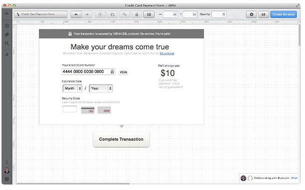
Basic structure of the interface in mind is the best form to start from. Bare boxes represent general content pieces and space that will be filled with UI elements. This will make you stay focused.

  1. Headline and Call-to-Action

The next step is to form two important elements; a headline and a call-to-action. In the headline, we’re  looking for something emotional, but not too catchy. Since we want our users to go forward smoothly, we can design a headline that is quite emotional but not too catchy.

Remember to give a statement that can support your customers in the sub-headline. For example, you can write, “we accept Visa, Mastercard, and American Express. If your card is not on the list, let us know.”

On the other hand, a call-to-action should be precise. Avoid using general things like “Continue”, “OK”, ”Done”-These kinds of words give nothing to the context for the whole process and may confuse your customers. Besides, these words have a lack of sense of urgency. Therefore, it is just seen as a call-to-action.

  1. Safety Indicators

I

In the paragraphs above, we were discussing the importance of safety and price in the credit card form. Let’s try!

Moreover, it is important to make sure that the payment process will go smoothly, take a look at some tips below:

  • At the top, we describe about the technical safety provided by the SSL protocol. That’s causing a positive frame around the whole form.
  • Second, we not only inform them about the price, but also we tell them that a refund is possible.
  1. Form Fields

In this part, we design important form fields. This kind of form will let you proceed with the payment without knowing our customer’s name due to a backend transactional mechanism, but you may need the CVV code.

Moreover, to indicate that all data is safe, we’ve decided to place an additional “lock” icon in the form field. Most credit cards in the world will put “/” between two selects of the Expiration Date, we’re I’m addressing the mental model created by credit cards.

  1. Labels and Prompts

At the last stage, we place labels and all the important prompts. We’ve applied the mechanism of the auto-detection of a credit card number. However, since we want my form to respond faster to user input, we designed a place for a credit card icon at the right of the Credit Card Number field.

Since the Security Code is always a tricky field, we’ve secured it with a textual prompt “Last 3 digits on the back. Amex: 4 on the front”, as well as icons showing where to find the code.

In conclusion, all of the attempts above are made to help you close the sales and gain money from your selling; therefore, you need to work together with your developers and designers to produce a payment page that support customers and make them feel comfortable with the ultimate UX design tips above.
Why UI Changes Annoy People and How to Handle It

When it comes to designing for good user interfaces, especially for website design interfaces, there are so many reading patterns that you can apply. Each pattern has their own knowledge of how people perceive visual information and theory of how to improve user experience while reading or observing content. Among so many theories, there are three patterns that gain the most popularity. They are the Gutenberg Diagram, the F-pattern, and the Z-pattern. If you are a web designer, we  highly recommend this article for you!

The Gutenberg Diagram
This theory reflects the western culture of reading which is top to bottom and left to right.

image 1 for UI changes

From the diagram above, we can see that there are four quadrants. For key contents like a headline and a logo, you’d better place it in the top left quadrant. Then, you can place logical conclusion in the bottom right quadrant in the bottom quadrant. Therefore, it is recommended to put a CTA (call-to-action) in this section in the form of text, a video, or a link.

The F-Pattern
In F-pattern, people start engaging with content by moving their eyes in a horizontal line. Then, they scan a vertical line trying to find the points they’re interested in. Then, they will continue what they’re looking for after scanning the content horizontally.

image 2 for UI changes


You can use elements like bullet, points, typography, colored buttons, and highlighted texts and so on to improve the user experience. These elements give visual weight to the interface and indicate important points.

The Z-Pattern
Many people consider Z-pattern as the king of landing pages since it covers important aspects including visual hierarchy, content structure, and CTAs. Different from F-pattern, which is more suitable for text- or content-heavy page, the Z-pattern efficiently grasps users’ attention on landing pages with minimal copy. Here is an image of Z-pattern.

image 3 for UI changes

You can follow the structure below when designing with the Z-pattern:

  1. A top horizontal line should include catchy contents and elements like the logo and navigation bar (so users can quickly access the website’s pages).
  2. Following a classic storytelling approach, a diagonal line should introduce users to the main content including the main copy, attention-grabbing images, slideshows, and so on.
  3. Finally, a lower horizontal line should feature a CTA that stimulates users to perform a certain action such as signing up, subscribing, or making a purchase.

How to Prevent User Dissatisfaction with Interface Changes

Since everyone is unique,  we cannot determine which pattern that might suit your users. To know what kind of pattern that might suit your readers; you can apply the following methods to evaluate the design and functionality of a new or an existing system with real users. Here are some of the methods:

A/B Testing
Comparing two different concepts is called as A/B testing or split testing. In A/B testing, you can compare buttons, CTAs, color schemes, and banners. The aim of A/B testing is to figure out which of various options is the most successful, for instance, which button gets the most clicks. Each case of A/B testing is unique. What elements you test depends on your business goals. However,  the following elements are generally tested:

  • Copy (product descriptions, button text, etc.)
  • Calls-to-action (for example, their placement or wording)
  • Application forms
  • Layouts
  • Images
  • Color Schemes

Bear in mind that in order to get relevant results, the A/B testing should be performed simultaneously. Besides, doing A/B tests will avoid you from audience backlash and can even help you achieve better conversion rates by making necessary tweaks to an interface.

Hallway Testing
If you are looking for an informal way, the hallway testing is the answer. It involves going to a crowded area and simply asking passers-by to test and evaluate an interface. For example, you may go to local Starbucks and do little interviews with strangers in that cozy place. You can also apply this method with your office colleagues. Therefore, to conduct testing successfully, you can plan everything in advance.

By performing this method, you can figure out what elements of an interface puzzle users and how your users conceive the system as a whole.

Five-Second Testing
The main purpose of 5-second testing is to elicit the user’s first impressions to an interface and discover whether a website or an app communicates its purpose to its visitors. In 5-seconds, they have to view an interface and try to remember as much as possible. Then, they will be given some questions regarding the sense of their reactions.

Through 5-second observing, you can generally aim at evaluating a visual UI component rather than the whole interface.

Conclusion
Even though the changes of UI will upset people,  ignoring the last trend will ruin your product. Therefore, you need to study your pattern before applying it. This trick will make the necessary tweaks without scaring off your users.