What Does Mobile First Index Actually Mean?

what-does-mobile-first-index-actually-mean

There are many things that a SEO analyst should master when it comes to SEO services. One of the examples is mobile first index, but first, let’s understands what indexing means. Indexing is described as the process of turning your webpage into something more useable and storing it in their database. You can find a lot of cool stuff that happens here. For instance, word vectors, and all kinds of other awesome computer science stuff. For our purposes though, Indexing is when they make a copy of your page in a format that’s useful to the ranking algorithm.

So What Is Mobile First Indexing?

Now, by creating signals based on Googlebot, you can figure out whether a site is mobile friendly or not. Therefore, a user searches Google the retrieval part of the algorithm looks at the desktop index created by the Googlebot desktop crawler. It finds relevant results based on the desktop index, then ranks them and even shows the searcher a snippet based on the desktop index. The ranker then looks at the mobile signals collected by mobile crawler and adjusts the rankings accordingly.

However, sometimes it can cause some problems. For example, in many cases where a user gets redirected and they realize that the content they saw in the search snippet isn’t available on the stripped down mobile version of the site.

Moreover, it is important to be remembered that “mobile index” and “mobile friendly” is a different thing. Mobile friendly is how you design your sites. So that it will be convenient enough to be displayed on your mobile. On the other hand, the categorization of mobile index includes three scenarios:

Responsive Site

Issues include things like changing the weights for tabbed content or drop-down menus which are probably less valued on desktop but shouldn’t (in theory) be devalued in mobile.

Separate Mobile and Desktop Sites

Here’s where things get tricky. If a site has device type redirects OR rel=alternate and canonical tags setup, then the mobile crawler will see the mobile site only, and not the desktop site. That means if some content is ONLY on the desktop site, the mobile Googlebot won’t see it and it won’t end up in the mobile first index. This is the issue Google is trying to solve, but it’s also an issue for many publishers.

No mobile site

The mobile Googlebot will still see these pages! The mobile crawler doesn’t just crawl “mobile friendly” pages. It crawls everything. These pages will still be seen – they just won’t get the “mobile friendly” designation – but that’s completely OK because it has absolutely nothing to do with mobile first indexing. Sure they won’t rank as well as mobile friendly sites – but they’re already not ranking as well as mobile friendly sites. That won’t change after mobile first indexing.
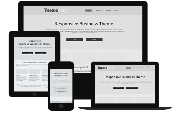
Is Bootstrap a Better Framework?

Is Bootstrap a Better Framework

Nothing is more popular rather than bootstrap, since this framework will suit best for web designer who’s looking for a sleek, simple and responsive front-end framework. In case, you are still new with this tool, you can read this little review and figure out if this is the one that you are looking for.

  • The Grid System

For most designers, grid system is the most noticeable part of a front end framework since with grid system, designers are able to prototype various layouts and then make any necessary adjustments as they see fit. In this part, Bootstrap has provided frameworks which are responsive and flesh out for mobile approach. This makes bootstrap excellent compared with other frameworks.

Talking about flexibility and pre-defined grids, Bootstrap provides a default grid system that’s totally in your hands to customize with Less and Sass, respectively. Moreover, it will give you static-sized widths that’ll subside when the viewport is at its limit.

  • Features

If you are looking for a complete and well thought out features, Bootstrap can be a good choice. Moreover, from the standpoint of designers, the features that come pre-built with Bootstrap are much more conducive to efficiently getting designers up and running with their objective of building a functional website with a theme which makes Bootstrap becomes the first choice. Another features in Bootstrap is that it is also responsive embeds which makes it a cinch to now incorporate responsiveness to different elements.

  • Browser Support and Performance

If some frameworks may have difficulties in some browsers, like internet explorer 8, but not with Bootstrap, browser support and performance are both very good. So, if you still want to enjoy using internet explorer 8, it is a wise idea to stay with Internet explorer 8.

In fact, nothing can beat bootstrap in terms of having a large selection of themes and choice in the form of plugins and widgets.

3 Web Design Trends in 2016 that You Should Be Careful About

web design

Like every trend, web design trend always comes and goes. Therefore, if you are web designer keeping up to date is the best solution to stay successful in this industry, so you can understand what is good and what is bad for your design. Below are 3 web design trends that you shouldn’t use in 2016, you can read this material to avoid you from any harmful mistake.

  1. Complex Typography

You may find that having more multiple typefaces is a good idea, while the fact is that sometimes using more than two multiple typefaces in your website will create a confusing and cluttered looking site, which reduces legibility and readability. However, at some point you still can use more than two typefaces in order to get a good effect.

In addition, another important point that you should remember related with fronts is about its spacing. A good spacing will work well for clarity. Below are some more tips related with typography that you can use:

  • Experiment with fonts. Aim for clean and clear presentation that also reflects the brand’s visual style.
  • Use fonts and typefaces that complement each other or are contrast enough to provide interesting color. In addition, you need to allow for psychological level when selecting the font/typeface as believe it or not certain color and certain type of typography will bring different emotions and feelings, for instance, a serif brings an air of formality, a sans-serif feels reliable and a script can be haughty.
  1. Put Everything Under a Hamburger Menu

In order to simplifying the navigation, designers keep hiding all of icon under a hamburger menu whether it is in desktop or in mobile devices. It is understandable that many designers will prefer to hide it under the hamburger menu just to make your site cleaner and sleeker. However, this also increases the risk of discoverability.

  1. Parallax Scrolling

Recently, parallax scrolling is one of the most favorable sites that allow the foreground and background content to scroll at different speeds which cause an illusion of depth. However, it is still debatable if it produces a good UX.

  • Bad for SEO

Since having parallax scrolling in your page will result in one page optimization, so search engines will only have a little way of content that can be crawled by the search engines. This is especially true as text tends to be embedded in graphics.

  • Can Reduce Performance

Moreover, due to its heavy use of graphics and JavaScript, the page will require longer time to load the image and this will cause more trouble for mobile users.

  • Can Affect Users Negatively

Some people may find that parallax site is more fun than the non-parallax sites, but some other people experience a motion sickness and significant usability issues toward parallax sites.