7 Common On-Site Search Mistakes and How to Fix Them

Common-On-Site-Search-Mistakes-and-How-to-Fix-Them_ywf

Search function is necessary in any website; therefore, you need to be more careful as search function could be damaging your conversion rates. However, when it is well optimized, you can enhance the search function, the usability and enjoyment of your site. As a web developer, you surely want more users enjoy your site, right? Learn how to optimize on-site search and avoid the common mistake that may occur.

It isn’t Visible
First, make sure that your search form isn’t invisible. Creating a search form that is hard to find will frustrate your users. So, ideally your search bar should be located near to the top and left side, the closer, the better. While the search box might not be the first thing that users will see, but you need to be smart to know where you can place it. The right location should be within normal reading patterns.

It isn’t Easy
Anything that places an obstacle between your user and completing their search detracts from its accessibility. So, make sure that any text would disappear once the user starts typing. On the other hand, it is important to increase the accessibility of your search bar include cosmetic changes like color use and text readability. Then, make sure they are sharp and contrasting.

Auto-Suggestions Aren’t Provided
With auto-suggestions, you can speed up the search process significantly for the user, especially if you offer multiple models or versions of a core product. In fact, the less time users must spend typing in their query, the longer they can spend engaging with the content they’re trying to find.

The 404 Isn’t Helpful
You can maximize the usage of 404 pages. It can be useful and beneficial for your users. For instance, you can place links to main directories, offer suggestions for reworking the search query, or direct them to your contact page. The point is to offer solution or answer to your users.

Results Aren’t Straightforward
It is important to create familiar and dressed down search result pages. Hide the bells and whistles of your engine under an advanced search link and, if possible, have the search menu expand without leaving the page. Make sure that the search results landing page is easy to read on first pass, providing legible, plain fonts, and clean composition so that results can be assessed individually.

Filters and Sorting Methods are separated
Since users don’t want to perform any additional work, ensure that sorting options, such as date, popularity, and etc. can be accessed from the same page. Place the options on the top left corner at the start of the search results to increase visibility.

No Search Variation
Always provide your users with variation search results. For example, when a user types “black dress”, you can offer them with alternative search query options and results (such as “black” and “dress”) in separate sections.

By this way, Google can provide closest equivalent, even if you don’t have the product or information they’re looking for. Providing something close, even if not exactly what they searched is more beneficial than an empty results page.
 

Find Out the Right Types of SSL Certificate for Your Website

Find out the right types of SLL certificate fo your website

Since, Google cybercrime gets bigger and bigger nowadays, the way Google assesses a website is change. In fact, Google is among the most proactive, they give better rewards to sites whose adding SSL certificates (or HTTPS). This makes many SEO engineers put a good attention on SSL certificate for their better SEO service. But, you need to be more careful in choosing the right SSL certificate, as there are many types of SSL certificate. Each SSL types use the same standard encryption methods but each option has their own requirements and distinct characteristics.

Option #1. Single Domain

Single domain (or single-name) SSL certificates protect a single domain. This SSL type really works well for simple and straightforward content-based sites. These sites include B2B sites, e-commerce ones where all transactions occur on a single domain. Someone has to get an authenticated domain ownership when she/he wants to get a “Domain-validated”.

Option #2. Multi-Domain (SAN)

Multi-domain SSL certificates are also what they sound like. Multi-domain SSL certificates are also referred to as “SAN” (for Subject Alternative Names). With SAN and one multi-domain SSL certificate, it will cover a suite of sites. So, they provide flexibility for covering sites that might go away or not yet exist.

Option #3 Wildcard

If you want to cover all subdomains on a single root domain or host name, wildcard SSL certificates will be suitable for you. It uses an unsecure, content-driven ‘marketing’ site on the primary domain. Fortunately, this SSL’s type can run all purchase-related through a secure subdomain. With this single wildcard SSL certificate, you can simplify the mess, and it also protects the main site.

Option #4 Organization

Organization SSL certificates works to authenticate a company’s identity and information, such as the company’s primary address, and etc. You may think that this is similar to single domain. But in organization SSL certificates, you will get more content-based sites. By this, you don’t need to secure an e-commerce or payments component.

Moreover, you also will be asked to confirm and authenticate the other organization-related details as well.

Option #5 Extended

The last option, called as extended is better known as the most secure option. They do the extra organization validation bit by verifying the domain. It also double checks the legal corporation. It will also show a green address bar on most modern browsers for your troubles. In Chrome, you’ll also get the company name like this Twitter example below:

1

Credibility is what you’re paying for here. But, the secure connection uses on your site are that different than any other reputable SSL connection.

Hence, by selecting the right SSL certificate types, you’ll get a single certificate to purchase and set up to protect multiple different sites.

Web Design Engineered for End Users and Search Engines

How to be a good Web Design Engineered for End Users and Search Engines

Search engineers optimization is a new trend in digital world since it has become a well-known strategy in the last 3-4 years. Due to this, SEO still sounds new in many business owners which as a result requires web developers and especially designers to adjust their works with it. If you are a designer who needs to deal with SEO, you better read and apply each point below onto your work.

  • Design elements for SEO and Users

There are two things that you should keep in mind when it comes to website development, they are the end user and search engine. It’s almost impossible to find a website developer who is also a master of SEO and user interface best practices, so we have identified essential design.

  • Define Clear Page Hierarchy and Structure

Having a messy website is a so much confusing thing for your end user, it is like you are walking into a store where everything is a mess and it’s hard to find what you want. Therefore, creating a simple website map, which can help the user identifies main pages, and design around the customer will make your website becomes an orderly digital place where information is easy to find.

One of the solutions for this problem is to develop a website with a clearly defined site map. A site map is a visual image of all the website’s pages and subpages which many developers usually call it as a family tree. It describes the top level navigation pages. Remember that the top level pages should always be the most pages with the best information for users and search engines like home, services, industries served, about, contact, and resources pages.

  • Everyone Likes Responsive Design

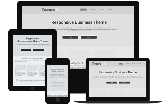
It is an open secret that Google and many other search engines love responsive design more than non-responsive one. This is because every user wants to interact with the responsive one and tend to leave a site that won’t display properly which cause search engines are vying for serving the best results one to each other.

  • Consistency Builds Credibility

A good branding is the only way to build a good credibility in design world. You can use images, headers, sub headers, images, graphics, forms, buttons, and footers to convey the same terminology which will help your users easily read and navigate your website. While consistency in design means that your overall images, buttons, graphics and colors should represent the overall brand and values.