Search engineers optimization is a new trend in digital world since it has become a well-known strategy in the last 3-4 years. Due to this, SEO still sounds new in many business owners which as a result requires web developers and especially designers to adjust their works with it. If you are a designer who needs to deal with SEO, you better read and apply each point below onto your work.
- Design elements for SEO and Users
There are two things that you should keep in mind when it comes to website development, they are the end user and search engine. It’s almost impossible to find a website developer who is also a master of SEO and user interface best practices, so we have identified essential design.
- Define Clear Page Hierarchy and Structure
Having a messy website is a so much confusing thing for your end user, it is like you are walking into a store where everything is a mess and it’s hard to find what you want. Therefore, creating a simple website map, which can help the user identifies main pages, and design around the customer will make your website becomes an orderly digital place where information is easy to find.
One of the solutions for this problem is to develop a website with a clearly defined site map. A site map is a visual image of all the website’s pages and subpages which many developers usually call it as a family tree. It describes the top level navigation pages. Remember that the top level pages should always be the most pages with the best information for users and search engines like home, services, industries served, about, contact, and resources pages.
- Everyone Likes Responsive Design
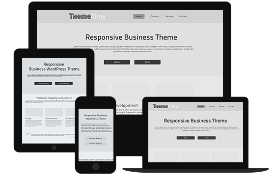
It is an open secret that Google and many other search engines love responsive design more than non-responsive one. This is because every user wants to interact with the responsive one and tend to leave a site that won’t display properly which cause search engines are vying for serving the best results one to each other.
- Consistency Builds Credibility
A good branding is the only way to build a good credibility in design world. You can use images, headers, sub headers, images, graphics, forms, buttons, and footers to convey the same terminology which will help your users easily read and navigate your website. While consistency in design means that your overall images, buttons, graphics and colors should represent the overall brand and values.


