Design requires a good taste of art; therefore, in order to succeed, one cannot compel their styles to users. In fact, a website designer needs to know what kind of styles that can fit to any website’s user experience and functionality at their first glance. This is where the challenge comes as how will we understand each person style. There are at least 5 crucial design tips that you can follow in order to create a professional site that may fit to general users. Here they are.
Keep your Homepage Minimalistic and Free of Clutter
Have you ever noticed that instead of reading every word on a website, we quickly scan pages, picking out keywords and sentences? Concerningthis behavior, it’s better to approach users through their emotion than word count. Therefore, when users are less likely to look at your site, that means, you have provided a good explanation about what is able to process and evaluate. Even though text in calls to action is still necessary, to make users feel easier in understanding what you want them to do, you’d better break them up with larger subheadings and legible paragraphs. Besides, you can also use images or icons as another way to communicate your point without the need of having too many words.
Design with Visual Hierarchy in Mind
As a designer, your job is not only creating a beautiful design, but you also have to arrange content in a clear manner. This is because we have lesser time to grab someone’s attention and explain them about your site. By establishing a clear hierarchy to your information, readers will automatically follow the plot you have created for them. For Further accentuation, you can apply color, contrast, size and spacing. These elements will also highlight the drawing attention on your page and making sure that it’s always intentional.
Furthermore, you can also use strips as one of the best designs for creating a strong visual hierarchy. In addition, strips will also help organize your website into clear, digestible pieces of content.
Create Easily Readable Website Content
One of the main characteristics of website users is that they don’t want to put much effort in understanding what you want to convey. Therefore, it is important to assess your content “readability” as it will measure how easy people will recognize words, sentences, and phrases. If your content readability is good, users will be able to efficiently scan your site and take in the information in the text without much effort.
If you want to improve your website readability, you can follow these steps:
- A good Contrast
To have a good readability, your text and its background should have sufficient contrast so that it will be clear to see. The main idea is never sacrifice readability for creativity.
- Be wise in choosing a font
In the early times, websites used small fonts, but over time, many people realize that it is difficult for people to read 12pt fonts when a screen is 24 inches from someone’s face. Now many designers prefer to use 16pt as a font standard. However, the number might be different, depending on which font you’re using, as some fonts have so many details that make it more difficult to read. In fact, there are some fonts that are actually suitable for online readers, such as Times New Roman, and many others. Avoid using script fonts that have so many cool fancy curves and stuff, but this font will hurt your visitors’ eyes.
- Be Careful with Using too Many Fonts
It is better to use three or less fonts rather than use more than three different typefaces throughout a single website, as using too many fonts will risk the overall effects look cluttered. So, make sure you make the fonts look harmonious instead of cluttered.
Create an Easy to Navigate Site
Bear in mind that a designer should create a design that helps visitors. Therefore, do not send your visitors into a wild forest where they don’t have anywhere to go. A site which is equipped with a solid navigation helps search engines index your content while improving the viewers’ experience.
Here are some tips for creating good navigations’ experience:
- Link your logo to your homepage; it is a traditional way to save your visitors some precious clicks.
- Place your menu on the top or in the header of your website and structured according to the importance of each section.
- You can apply some vertical navigation, such as anchor menu; this will work best on your site, especially if your site is of the long scrolling variety.
- Don’t ignore your footer even though it is probably the last thing to be seen on your site since you can put so many information on it, such as placing links, a shortened version of your menu, social icons and additional important links that your visitors may need.
Stay Mobile Friendly
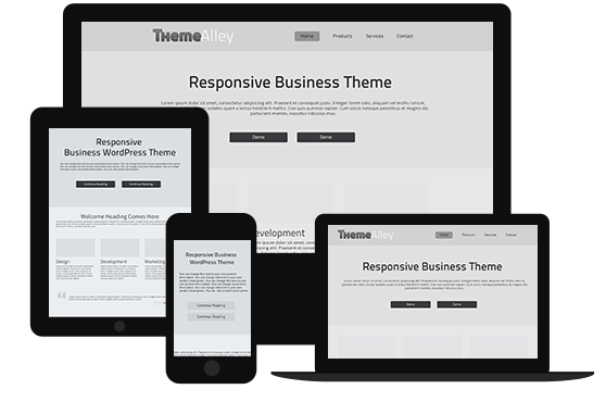
Since everybody is going mobile, it is important to design a website which is mobile friendly. A mobile friendly design should enable visitors to access your website on the go. Furthermore, the main key to design for mobile users is to put your position in the position of the user, and test out every page of user action and button.
By carefully applying the tips above, you can produce website designs that are not only beautiful but also functional. So, make sure you remember the tips above when designing for a website. However, if you find any difficulties while designing for your website, you can ask web designers to help you build a better design.

