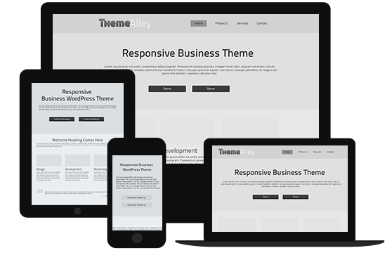
Nowadays, where all attention is in mobile-first design, desktop-first design seems less popular. This is because many designers aim to create responsive design. However, starting from desktop is not the bad. In fact, this design works better if you want to create feature-rich designs. This workflow may not as popular as mobile-first design, but as a web designer, you should know why you also need to put attention on desktop-first design.
The Benefits of Desktop-First
Generally, desktop first is something that everyone made websites up until the responsive era. Today, with so many people talk about mobile first, there are still so many reasons why we have to stick with the desktop approach, especially if you want your site have tons of detailed features on larger screens.
Here are some benefits of the desktop-first ideologies.
- You get to see all major features at once
- It lets you imagine all the largest possibilities for your design first
- It’s the best strategy if your audience mostly uses desktops/laptops
You must think that any modern websites like Twitter puts mobile-first design. However, even Twitter have lots of extra features that come along with the desktop experience. Therefore, you need to create feature-rich websites that depend on a strong desktop design. This is perhaps the biggest benefit of a desktop-first layout. You get to see the site as it should look with all of its accessories. These extras can be removed for smaller screens as you test and find certain features just don’t carry over well.
It’s easy to consider dynamic features more like an afterthought with a mobile-first approach. But, you’re treating these features as the primary display method with a desktop-first approach, then choosing to remove them as needed.
No one is better than other, so you can try both of them to see what you prefer. Working from smaller area or starting from desktop then working smaller.
Supporting All Browsers
Handling browser support is the trickiest part of desktop-first design. In fact, it is reasonable for all mobile browsers to basically support the same features as desktop browsers. The main difference can be seen not in HTML/CSS support, but rather in touch-based support.
So, it is important to consider how the different browsers work, what they support, and how to handle the user’s touch-based input when moving from desktop to mobile. A few good rules to consider while scaling down your desktop-first design:
- Increase body text size so links are easier to tap
- Make tappable elements larger
- Add JavaScript libraries that support swipe motions
Graceful Degradation
Graceful degradation is a process that builds all your website’s top features with everything you want on the site, and then if other browsers can’t support them you revert to fallback methods. A common example of this tactic is the removal of dropdown sliding menus for mobile. However, rather a change in user experience, this isn’t strictly graceful degradation. On the other hand, you’re searching for JS functions or CSS3 properties that literally cannot be supported in a certain browser.
When Desktop Takes Priority
After all, you can think about designing a site where desktop takes priority over mobile. If the mobile experience can be incredibly simple but the desktop experience needs to be detailed and dynamic. But, you also should have a plan for the mobile site with at least a vague idea in mind of how it’ll look.

