Review of Native Apps, Web Apps and Hybrid Apps

Most mobile applications are divided into three categories, native apps, hybrid apps, and web apps. For coding builders, these categories are necessary to be known before deciding to build which applications are suitable for their programs as choosing the right categories will determine almost everything, such as, the user, the difficulty, and etc. Moreover, by knowing the characteristics of each category will make the developer know the right app to be built in the right mobile devices. The right device will determine the right market. This answer to this question may also be budget driven, so based on how fast the client wants to get up and running. So, here are some reviews about native, web, and hybrid app.

Native Apps

A native app is written for a specific platform. It is built for a particular device and it also has the ability to use device-specific hardware and software, this makes a native apps have more advantages of being able to optimally use the features available on mobile devices. Because mobile applications have traditionally been written to work on a specific device platform, then it is often mentioned in the context of mobile computing. In this category of apps, Internet connectivity may not be required but heavily depends on the nature of the native app.

Web Apps

A web application development or web app is web style of application that runs fully in a web browser. It is created in a browser-supported programming language. Moreover, it is a highly programmable environment that allows easy customization through the immediate deployment of a large and diverse range of applications, to millions of global users. There is no need to release any app updates if you want to make a change to a web app.

Hybrid Apps

A Hybrid app is an app that combines the elements of native and web applications (any web application that used in a web browser). If in native application, the internet connection is a must, in hybrid app mode, the application can function whether or not it is connected. Besides the mentioned application features, the features that hybrid app provides are integration with a device’s file system, integration with web-based services, and embedded browser to improve access to dynamic online content. Mostly, these days, many applications are considered as hybrid apps.


There is no single answer to the selection of the format.  But know the advantages and disadvantages of each can help make the decision for both the developers and the clients.
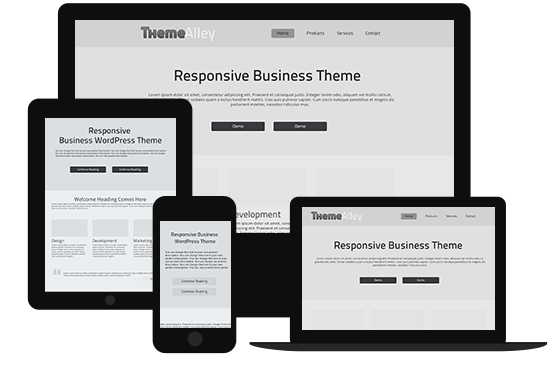
Why We Need a Website for Business

Almost half of the world population now connects with the Internet. This makes the internet become a large market for any business. If you want to do business, a huge market must be an interesting topic for your ears. In reaching that kind of a huge market, having a website is an important part way to achieve that. This is why we need a website to expand our business, especially in online business through website development. Here are more detail reasons why you need a website.

  • Promoting Your business

In the olden days, business relied on static/printed advertising, however, these days where we live in a digital era, static advertising can be put on a website and turned into something more interesting with the touch of graphic design. It can be more dynamic with nice graphics and movement. The advertisement  on the web can be made more rich with the addition of pictures, text, tables and many others things which are felt necessary to be put in order to grab your prospective customer’s attention.

  • Others can preview your shop 24 hours

By providing a website, you employ a machine to work for you. It does not recognize the word tired, so even when you aren’t at work, yours website is. It lets people access your shop even it if is 3.00 a.m. Your customers can get to know yours products through their time, not your time limitations.

  • Finding New Clients

Like it is said in the beginning that internet is a promising market, it is true that more and more  people are searching for everything online. Even word-of-mouth promotions will need a website to support it, for example what will you do when people recommend a shop to you, certainly, you will find out some information about it online, right?

  • Maintain Your Faithful Customer.

You can serve your old customer in more efficient support, information and resources. Moreover, you also can understand your consumer more. Since, there are Google analytics and website stats that can tell you the age, location, gender, “affinity categories” (technophiles, music lovers, games etc.) that can attract your visitor’s interests and actions. In addition, by tracking their progress through a website, your visitor goals can be defined from what content on the sites which inspires them.

6 Common Web Design Mistakes for New Web Designer

Even though, web design is all about development, however some mistakes in creating efficient web designs still occur.  In fact, the mistakes that appear in your web design are often also found in other website designs around the world.  Web designers don’t often have the time to think about all these things, however this can have a big impact to natural web rank. So, here are some common mistakes that are made. Read this for helping you understand and prevent making the same mistakes that can lower your web rank.

  1. There is no search box.

If you have a lot of posting on the website, even though you think you have a good categorisation, but if there is no search box, then finding your content will become a hard task. Putting a search box in neat, simple and effective way will help your visitor to find what they want to find.

  1. Poor Readability & Legibility

An easy to read website and content will easily grab a user’s attention and make them comfortable in reading your material, to make a website comfortable to be read, one should consider the font styles and sizes to avoid pain in reading.  Stay away from hard to read bright colours or colours that blend in with its surrounding. Don’t forget, newspapers have been successful for many centuries and you can understand why.

  1. Unorganized content layout

This means notice your website’s content and its placement and layout. Some designers just put a text on the web page and ignore the headings, sub-headings, bullets, keywords, paragraphs and forget to name the page title.  If you have a lot of text, think about breaking it up into smaller pieces with subheadings.

  1. Bad navigation

Navigation should be smooth and seamless. It can be done by using textual descriptions for all thelinks. Do not forget to provide alt text for images. Moreover, organizing and structuring your navigation in tandem with the theme of the website. Personal website may be more creative yet accessible however a business website needs more efficiency and clarity.

  1. Inconsistent Interface Design

Avoid the inconsistent interface designs in your web design; create a standard but consistent template for every page with links to the main sections of the site. In addition, create aesthetically simple designs, so users will never get confused when navigating your website.

  1. Unfriendly screen resolution

A good web designer will make a website fit on most screen sizes. This makes user can see a whole web page efficiently without needing to scroll horizontally, especially for a mobile user who usually finds it inefficient for scrolling and zooming around. Use of responsive layouts is highly recommended and is amongst Google’s top criteria too.