2014 is almost end, but it’s not a bad idea to look back what type of Web Design that had been used for whole one year.
These designs mostly used by some famous web developer to build their websites and attract the customers, so it should be quite inspiring and would be improvement reference for upcoming year :
1. Non-boring Typography
Fonts is the most essential thing to build a different personality inside a website. Most designers this year made a unique differentiate by change the template’s fonts.
Some example provided above is the idea what kind of change they did in terms of fonts. Of course many others tried their best change the Serif font and overused typefaces.
- Flat Design
Based on Apple’s latest pamphlet, we’d say the idea of Flat Design makes people feel more elegant and simplified in many ways.
Apple has a long time been a trendsetter, and usually when they did, the rest seems follow. But of course this “flat” designs not really anticipated until end of this year.
- Large Areas used more than Sliders
With little amount of text Large areas makes website more spacey in some places is the main idea for most design full website, take a look on these example :
Basically the idea to make sure customers sees as large as possible the image or background and make a huge scale difference between Image and Text inside it.
This idea usually installed in some famous property, big product that serves more images rather than description itself.
- Focus more on Mobile
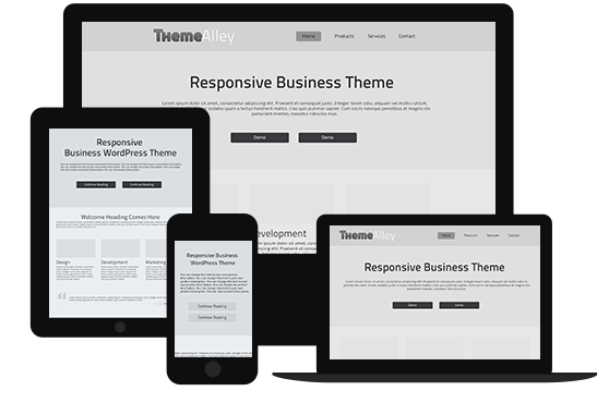
With more advance technologies comes up especially on Smartphone or Tablet, who would bother to look websites in normal PC browser ? Many companies now focus more to either Mobile Web View or Apps that help smartphone users to view it more professionally in their own devices.
Of course in terms in Smartphone, integration with Social Media is important to make the website more shareable and friendly interface. Even a smaller peace share option such as e-mail subscription always will do the task.
- Video Approachable More than Text
Most people prefer viewing Video rather than bunch of texts that makes customers confused. With that, some website such as Coin utilize video in its Hero Area
Videos are becoming easier to produce and share, which help most of customers to share on their Social Media. But of course this might disturb some areas that doesn’t have a good connection. There’s no problem with that, as for some Video host server such as Youtube has provide a better server to help them.
- Long Scrolling Sites
Long time ago, a long scrolling websites might bore the customers to visit, but now with more simplified design either in effects or in colors, they’re back with more simplified content and put in more pictures. Make the website more interactive in many ways.
This is sample of design that has reform Long Scrolling Sites.
7. Simple Color Schemes
Remember the trends of 2-color styled by emboss each other color. It was pretty nice by seeing it but most developers sense that it’s quite took some time to load the effects on each color.
With new year in 2014, we’ve seen so many websites took a simple plain color schemes (up to 1 – 2 colors at most)
These new style of color not only bring a lighter websites but sometimes elegant in certain ways.
- Simplified Content
Lighter content also roles in faster to load websites. This terms can be seen in one of famous Social Media, Twitter.
Of course this will shorter any information could provide. Usually they put it in separated Pages to help simplified matter instead of put everything in one page.
- Dropping Sidebar
Some websites tends to having sidebar that we know well one of it is Blog or Magazine types. By getting rid of the Sidebar, you may view it more expanded and professional in some ways. To put it simple, makes any Blog type websites more into Personal Magazine websites.
Take a look on one of this sample, although it’s blog, but more like a News and Notification-only websites.
10. Manipulated Images
This style should done more by photographer or designer’s website to put their portfolio approachable and simplified.
The idea actually came from Instagram, make the image “blends” more with text and have it natural view.
