Social Media – Wise to Handle Negative Feedback

The era of internet has changed the way people communicate in line with how they interact each other. In the real world, people can possibly air their ire directly face to face or by phone.

Subsequent to Internet has brought up a virtually communicative world,  the way people complain or vent their negative feedback  has changed and expanded in many different ways, as the anonymity of the internet lets them hide behind a computer screen. You will find people that troll, send spam or just create some random complaints.  There are also many genuine voices out there to be heard and listened to. Here is some advice to get you thinking:

  1. Listening

Listening is always important when approaching any complaints as the first step to understanding the situation.  There may be many clear examples of what your customers don’t like, but often, we don’t go out of our way to find this information.

Socialmention.com is a site that allows you to put the name of your company in the search field where it can search the internet for places where your company has been mentioned.

Get on Facebook and Twitter. Search for the name of your company or product on Twitter to see what is being talked about.  Search for your company on Google. Do you find conversations out there about your products?

  1. Understanding and address the problem

If someone talks behind your back about you as they have an issue with your company, address their concern. This way, people will see it and find that the company is indeed listening to their concerns. It is often a good way to handle complaints early on, rather than letting it simmer and snow ball with more of your customers (and potential customers).

  1. Involvement in the conversation factor

Take heart, join the conversation, and solutions will come somehow as you face to handle the issue with the customer. Don’t argue with them, neither respond defensively, simply put empathy of the issue out there as impartially as you possibly could.  As negative comments come up, you will find people even defending your side of the situation, but only if you stay away from the blame game and negative comment trap.  Stay positive, assured of your responses and responsive to the customer, and you will have good standing in their eyes.
“Online shopping — the basics you need to know”

Ever since the internet has reigned, it has slowly taken over a lot of the business opportunities through popular online shopping websites, one of e-commerce businesses. Some people are interested because of the hype it promises, whereas others are just looking for alternatives to shopping in a mall.

 It’s not just the shopping

Online stores are now becoming ubiquitous, as individuals can buy with just a few clicks, from clothes, gadgets, shoes, appliances and even daily groceries. Of course it’s because of that advantage that people are jumping on the trend.

Saving time, fuel, energy are among the causes that make the online shopping an appealing alternative.

Shopping can be tiring sometimes, and what is worse is when there are no available stocks for the merchandise you want to buy.  With online shopping, you can short cut that unwanted procedure.

Beside comparison of prices through search engines allows you to easily check prices and compare with just a few clicks, with it you are able to look for specific merchandise that includes model number, style, size, and color that you want to purchase. In addition, it is often easy to determine whether the products are available or out of stock.

You can also compare prices from online shopping websites to each other.  Furthermore, online shops are open 24 hours, Sunday to Monday with no holidays to worry about.

Besides, when buying items online, you can jump the queue i.e. no need for queue just to buy your merchandise.

Cyber-transaction is really a more private way to perform your shopping duties for items that otherwise you may ashamed of buying, like weird ornaments, sexy lingerie, adult toys, etc.

What is the catch?

Seeing things by touching physically before buying instead of gazing through the screen is one of the reasons people stay away from buying online. As online stores only show product description and photos of the merchandise, you as a customer who wants to buy and try or use it the straightaway, often can’t get that experience of instant satisfaction. After all, a lot of shopping is about impulse buying. You see it, like it, and want it.

As far as quality is concerned, you can find the same quality online as well as in the shop, so that is less of concern, especially with all the competitive return policies offered by online shops.  More of an issue lies with running into counterfeit goods situations, especially from untrusted vendors.  A source quoted reporting that giant Alibaba pledged recently to do more to fight online sales of counterfeit goods, quickly settling a public dispute with a Chinese regulator which named many of the Alibaba stores as rampant with such products.

Trendy Web Design in 2014

2014 is almost end, but it’s not a bad idea to look back what type of Web Design that had been used for whole one year.

These designs mostly used by some famous web developer to build their websites and attract the customers, so it should be quite inspiring and would be improvement reference for upcoming year :

1. Non-boring Typography 

Fonts is the most essential thing to build a different personality inside a website. Most designers this year made a unique differentiate by change the template’s fonts.

Some example provided above is the idea what kind of change they did in terms of fonts. Of course many others tried their best change the Serif font and overused typefaces.


  1. Flat Design

Based on Apple’s latest pamphlet, we’d say the idea of Flat Design makes people feel more elegant and simplified in many ways.

Apple has a long time been a trendsetter, and usually when they did, the rest seems follow. But of course this “flat” designs not really anticipated until end of this year.


  1. Large Areas used more than Sliders

With little amount of text Large areas makes website more spacey in some places is the main idea for most design full website, take a look on these example :

Basically the idea to make sure customers sees as large as possible the image or background and make a huge scale difference between Image and Text inside it.

This idea usually installed in some famous property, big product that serves more images rather than description itself.


  1. Focus more on Mobile

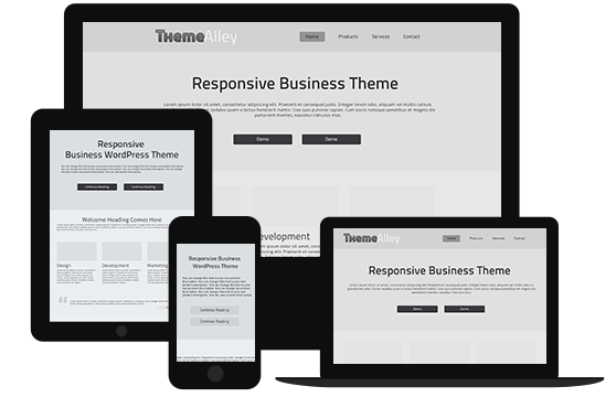
With more advance technologies comes up especially on Smartphone or Tablet, who would bother to look websites in normal PC browser ? Many companies now focus more to either Mobile Web View or Apps that help smartphone users to view it more professionally in their own devices.

Of course in terms in Smartphone, integration with Social Media is important to make the website more shareable and friendly interface. Even a smaller peace share option such as e-mail subscription always will do the task.


  1. Video Approachable More than Text

Most people prefer viewing Video rather than bunch of texts that makes customers confused. With that, some website such as Coin utilize video in its Hero Area

Videos are becoming easier to produce and share, which help most of customers to share on their Social Media. But of course this might disturb some areas that doesn’t have a good connection. There’s no problem with that, as for some Video host server such as Youtube has provide a better server to help them.


  1. Long Scrolling Sites

Long time ago, a long scrolling websites might bore the customers to visit, but now with more simplified design either in effects or in colors, they’re back with more simplified content and put in more pictures. Make the website more interactive in many ways.

This is sample of design that has reform Long Scrolling Sites.


7.  Simple Color Schemes

Remember the trends of 2-color styled by emboss each other color. It was pretty nice by seeing it but most developers sense that it’s quite took some time to load the effects on each color.

With new year in 2014, we’ve seen so many websites took a simple plain color schemes (up to 1 – 2 colors at most)

These new style of color not only bring a lighter websites but sometimes elegant in certain ways.

  1. Simplified Content

Lighter content also roles in faster to load websites. This terms can be seen in one of famous Social Media, Twitter.

Of course this will shorter any information could provide. Usually they put it in separated Pages to help simplified matter instead of put everything in one page.


  1. Dropping Sidebar

Some websites tends to having sidebar that we know well one of it is Blog or Magazine types. By getting rid of the Sidebar, you may view it more expanded and professional in some ways. To put it simple, makes any Blog type websites more into Personal Magazine websites.

Take a look on one of this sample, although it’s blog, but more like a News and Notification-only websites.


10. Manipulated Images

This style should done more by photographer or designer’s website to put their portfolio approachable and simplified.

The idea actually came from Instagram, make the image “blends” more with text and have it natural view.